Thursday 31 October 2013

Studio Brief 3 - Alphabet Soup - Typeface (3/3)


I started experimenting with different manipulations using the diagonal lines and the cut off corners. I used the pathfinder menu to achieve this. I used the grid whilst designing this type to try and make it as accurate as possible. I experimented by changing different sections of each letterform and made sure i tried out a few ideas.


I decided to go with the diagonal lines running upwards from the left to the right as if they were leaning forward. This shows my partners outgoing personality. I wanted to make the diagonal sections of the letter have a stroke weight at a ratio of 118:150 to the thickest part of the letterform. To do this I had to do some simple maths. I divided 118 by 150 and the multiplied it by 100. This gave me the percentage I needed to achieve the ratio. When rounded up it was 79%.


I drew out the boxes at the same width as the thickest point in the letterform and then used the scale tool to make them the right ratio. 


When working on the letters I had not kept them all to the same size which was a mistake as I had to spend a long time lining up the manipulated letterforms with the original typeface to ensure each glyph was the right size. I also changed some of the heights on the serifs as I wanted to ensure all the letters in lower case had the same height serif. 


After I had all the letters at the right size and the right height I wanted to round off the edges slightly. I felt that it was too sharp and unforgiving and this did not show Josiah's personality. I wanted to make it look slightly friendlier whilst still keeping the clean cut precise aesthetic. 


I was really pleased with the way the typeface came out and I would like to look at making it into a working font.


Wednesday 30 October 2013

Studio Brief 3 - Alphabet Soup - Typeface (2/3)


I started the ideas stage of the project by listing the key points of my partners personality. These were, hard working, precise and neat, smart and clean cut, control freak and a passion for house and techno music.
One of my initial ideas, which i spent a while doing sketches for (a couple shown above) was incorporating sound waves into my letterforms. Although I did like the way this could look visually I felt the concept was far too obvious and had no depth. 
I started thinking about Josiah's love of Scandinavian design and how he intends to live in Oslo one day. I wanted to incorporate this so I spent some time on various design websites looking at Scandinavian design. Although I did really like the style of the scandinavian design I looked at, it was not this that gave me inspiration. One thing I noticed was the use of umlauts. I researched into these further, looking at both accented vowels and umlauts. I found out that accented vowels are not used in scandinavia so focused just on the umlauts. I intended to uses at least one of these glyphs once i had come up with the design of the final piece. One of the glyphs that I liked was the o with the diagonal strike through. This gave me the idea of using diagonal lines as part of the typeface. I felt it worked for 
Josiah as the idea not only originated from scandinavian design, one of his passions but it also fit with the concept of clean cut and precise.


I wanted to incorporate Josiah's love of house and techno music into the design of this piece. I had already experimented with one idea that I had decided I didn't like. I wanted more knowledge of this genre of music to allow me more to work with. I looked online, reading about the scene nowadays of house and techno and the origins of these music forms. I came across the comparison chart shown above and this was really helpful. It got me thinking about the timing and BPM of the music and how i could incorporate measurements such as this into the design of  the type. 
The BPM in house and techno generally ranges between 118 and 150. I decided to use these to figures as a ratio. The line weight of the diagonal strokes would be a ratio of 118:150 to the thickest line weight in the letterform. I also had the idea of incorporating the 4/4 beat that both of these genres share by splitting the image up into 4 parts. I felt I had enough ideas to start sketching some of them out. 


I presented some of these sketches during the group crits. We walked round looking at each others work and leaving feedback. I got lots of feedback which i didn't find helpful. I had lots of positive comments but not much constructive criticism and I think this is partly my fault due to the fact that I did not present my development very clearly. One person told me to look at sound graphs and sound waves but this was an idea I had already tried and discarded. I had some feedback saying that they like the idea of the letterform being split into four parts but also had people saying it may affect legibility. I wasn't particularly happy with this idea anyway and if it was going to affect legibility I felt that it wasn't worth pursuing. Due to the positive feedback and lack of criticism of my diagonal lines concept I decided to pursue this.


Thursday 24 October 2013

Design Principles - An introduction to type


In the introduction to type seminar we looked at how a letterform can have many different meanings and connotations. We analysed a capital 'A' and looked at how to us this connotes a sound. However the letterform itself only connotes this sound because it has been agreed upon in the past. There is nothing in the symbol which displays an 'a' sound. A quote that was shown really interested me as I have never thought about it before but it seems really obvious. It was 'for a language to exist all that is necessary is for a group of people to agree that one thing stands for another.'

We looked at how typography today has been influenced by the production methods used to produce type historically. The production methods we looked at were: stone, sable, bone, wood and silicone. By looking at typefaces we can see where their origins lie by analysing which production methid we think was originally used for the type. For example, letters with serifs that use brackets were probably originally made of stone as serifs were used to ensure the stone didn't chip when carved into.


Prior to the session were asked to print out letterforms from 3 typefaces that we felt were completely different. We weren't given any more information than this. I chose Gotham, (a modern sans serif typeface) Georgia (a much more formal serif typeface) and Mitsral (a chalkboard style script typeface.)
We were put into groups and in these groups took each typeface and tried to categorise them by production method. This task was more difficult than you would imagine as lots of the typefaces had characteristics that could have originated in various production methods.


We then showed the typefaces in the categories to the whole class and looking at the difference in opinion between the groups was interesting. We were told how looking at the production method of a font was vital when analyzing typography. I feel this session gave me a better understanding of typography and its origins.


Studio Brief 3 - Alphabet Soup - Typeface (1/3)


For this project we were partnered up with another member of our class. I was partnered with Josiah Craven. We spent time with one another trying to find out as much as possible about each other as we would be creating a typeface based on our partners personality. We were given some questions that are regularly used in The Guardian as a starting point.


The questions and answers are as follows.

When are you happiest?
A good night out with a good DJ

What is your greatest fear?
Heights

What is your favourite place?
London/Northumberland

What is your earliest memory?
Me and my brother stained the curtains with chocolate mousse

What makes you unhappy?
When things aren't clean and tidy and when there is silence 

What is your dream job?
Other than a Graphic Designer, working in the stock exchange, being a DJ or a Chef

Who would play you in a film of your life?
Leonardo Dicaprio 

What is your favourite smell?
Tarmac

What is your favourite word?
Spoon

Fancy dress costume of choice?
Iron Man

Guiltiest Pleasure?
Made in Chelsea

What would you change from your past? 
Nothing


These questions did help me to get to know Josiah fairly well but I wanted more information before I started designing the typeface. I made a mind map of his personality as you can see above. The key points that i picked out were: Hard working, clean cut, neat and tidy, outgoing and he has a passion for house and techno music. I also asked him about his preferences within design. He told me that he really liked Scandinavian design. Alongside this, i asked him to write out his name in his handwriting. 


With all this information I felt I had enough to make a start on the ideas for the typeface 


Thursday 17 October 2013

Alphabet Soup Design Process (2/2)

After the crits I started thinking about a way to simplify the concept that I was working with. I realised that I was trying to convey a different word with each different letter and this was the problem. I decided that one letter was not enough to convey a word, especially when I was trying to make the changes to the letters fairly subtle. I don't necessarily want to design a typeface that can be used for body copy but at the same time I don't want the changes to each letter to be over the top. 


I decided that I either needed to completely drop the concept I was working with or refine it. I did like the idea, I think it is an interesting way to approach the word domestic. I started thinking about the reasons that domestic life can be described with the words I was initially using (safe, secure, routine, slow, comfortable, restricted, laid back, loving, watched, united, close, provided for, confusing.)
After a while of throwing about a few different ideas I decided that domestic life can be described with all these words is because in a domestic environment you are living in close proximity with people who you have a close relationship with. I wanted to try and convey this idea of closeness with my letterforms. I started doing some more sketches, some of which are shown below.  


Each of the letterforms convey closeness but each in a different way. It was quite difficult to come up with different ways of manipulating type. Especially after coming up with one process that is effective, it was tempting to apply this to each letterform. However I came up with ten different variations to ensure that I met the brief. 


I started producing some of the letterforms on Adobe Illustrator. I felt that some of the outcomes looked good created digitally but I felt that with some of the pieces it would be more interesting to look at different processes. I also decided to draw some out just using pencil and fineliner as some of the manipulations were difficult to do using Illustrator. 
After looking at some work by Lobulo Design (shown here) I felt that the 't' would be an interesting letter to try creating using paper and card. I felt it would look be more tactile and be an interesting way to approach manipulation of type. Shown below is the final letterform. I used thin black card and stuck the crossbar onto the stem but raised slightly. I felt this would create some interesting shadows and the two parts of the letter not touching but being close to one another fits the concept.


Another letterform that I had created on Illustrator but had ideas for hand rendering was the 'e.' I liked the idea of the letterform being repeated directly behind the original glyph, each time getting slightly smaller. I wanted to continue with this idea. I though about using paper or card in a similar way to how I have produced the 't.' I wanted to experiment further however. I had the idea of using acetate to show the letters getting smaller each placed directly behind another. It looked effective but i felt that each sheet of acetate needed a space between them to convey the concept of closeness. I experimented with different ways of doing this. In the end I used pins and white tack to achieve the effect i was after. 


I was happy with my final outcomes (shown below) but if I had more time to work on the project I would have liked to experiment further with making 3D type. I feel that I could easily adapt some of my 2D outcomes to be 3D and they would be effective.


Friday 11 October 2013

Group Crits


During the group Crits session we looked at everyones work and spent time analysing each piece and providing suggestions. I felt this part of the session just as helpful as the criticisms of my work. It was good to see how other people had approached their projects and this gave me a couple of ideas myself. 
After explaining my project I received some feedback, some positive and some negative. The pieces of advice and ideas I think i will build upon are the two in the middle on the images shown above. I need to think about taking away from the letters and modifying them subtly rather than adding a lot to them. I should also simplify it by taking one aspect of domestic life and focusing on this. At first i felt this was too simple but I am now starting to think that it may mean that I produce a better more concise outcome.

Thursday 10 October 2013

Alphabet Soup Design Process (1/2)


After brainstorming the word I still hadn't come up with any ideas which I felt were strong enough to take forward. I was really struggling with how I could show domestic with type. I decided to come at it from a different angle. Possibly making it more personal to my experience with domestic life. I came up with the idea of assigning a glyph to a member of my family and trying to convey that person using the type. I felt that although this was linked with the word domestic the idea was slightly too detached from the word i was originally given. I decided maybe if I focused on one aspect of domestic life, for example the repetitiveness, It would simplify the task and also give me something easier to show visually. I decided that again this may be too tenuous a link to the word 'domestic'.

Still working with the idea of making it personal I decided that one way to approach it would be to use each letterform to put across my opinions of domestic life. I came up with a selection of words that I felt described my experience of domestic life. I also asked for the input of others however any word that i didn't feel applied to my family life I discounted. I had 12 words which i felt would be interesting to show visually. The words were: safe, routine, restricted, comfortable, laid back, loving, watched, united, close, provided for and confusing. I started sketching out some letter forms and experimenting with conveying a selection of the words.

<images>

After sketching these ideas out I was struggling to come up with anymore. I used Adobe Illustrator to mock up some of the letters to see which ones were effective and which ones weren't. This is what I intend to show in crits as i feel there is definitely still work to be done on the letters but I don't know where to go with them. Until crits i will continue researching and looking for inspiration


Monday 7 October 2013

Alphabet Soup Briefing


Today we were given the brief for the Visual Thinking - Alphabet Soup project. We had both the module brief and the project brief explained to us. We then each picked a word out of one jar and a typeface out of another. The word i picked was 'domestic' and I got Futura as my typeface. At first I was disappointed with this word as i felt that it was quite boring and I didn't have any immediate ideas of how to convey this word through letterforms. I was pleased with Futura as my typeface as I am fairly familiar with it and would say it is one of my favourite typefaces. 


Despite my initial feelings towards the word that I was given I spent time brainstorming the word. I also looked up some alternate meanings on the internet. I managed to think of some ideas based on the word domestic that I feel I could display visually. I still have no solid idea but I feel more confident that I will be able to come up with an effective outcome. 
We also did an exercise in groups where we passed around the piece of paper with our word on and each member of the group had to write something that they associate with this word on the back. This is displayed in my sketchbook which is shown above. The exercise was really useful to see people immediate responses to the word. 
We repeated this exercise with the typeface and I don't feel that this helped anywhere near as much as with the word.


Sunday 6 October 2013

Introduction Brief Process (2/2)


 We wrote out an email as a group asking for the input of some 3rd year students. We sent this email to the course administrator and asked him to forward it to all of the third year students. We got 5 responses which was perfect as this was the amount we were hoping to put into the poster. Each student provided images like we had asked and also a piece of advice. The advice they provided was more than we wanted ideally so we picked out a few key lines.


After picking out the quotes we wanted to use and collecting all of the images together that the students sent out we had to make the framework for the design of the image. We already had a plan for the way we wanted to lay the work out. The paper would fold into 24 rectangles to fit into the business card sized envelope. Each rectangle would have either a section of type or an image on.


I then set about producing the inDesign document. To start off with i set up the basic framework, adding columns, a baseline grid and changing the sizes of both the side and top margins.


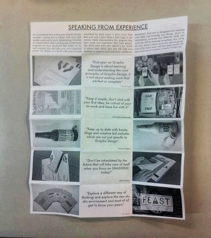
This part was the easy bit. We then had to put all of the content into the framework. We spent time deciding upon typefaces, eventually settling on Futura for the titles and subheadings and Georgia for the body text. We aligned the images of the students earlier work in one column and then the students later work in another column with their quotes in the column between these. This grid system will make the hand out self explanatory and easy to understand whilst still having a nice balance to it. Shown below is an image of the print out prototype piece. 


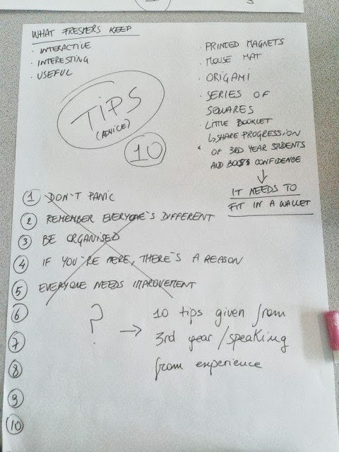
During crits we displayed the poster. We were pleased with the poster and the envelope we designed to put the poster inside. The feedback we got was really good, people seemed to like the design and the idea of it. We were given some feedback which I feel was useful and in the end helped to make the piece much stronger. Shown below is a photograph of notes from crits.

We started experimenting with the design of the envelope. We tried different typefaces and designs but we wanted to keep it really simple and to the point.


We made a net on illustrator, some of the variations we looked at are shown above. Also shown above are the first envelopes, the net as it is and also one after it had been assembled.
We started working on the improvements for the peice. Spending more time researching work that we could use as Inspiration. I got lots of inspiration from a designer named Sidney Lim Yi Xiang whose work I have displayed on my Design context blog.
We looked at some more typefaces as we were told that the one we were using looked too formal. After some deliberation we settled on Gotham as we felt this was simple enough so that it didn't distract from the image however it didn't make the piece look overly formal.
Drawing on another point that was made during the crit we simplified the text explaining what our piece was about. We reduced it to 6 short sentences that not only ready well but also looked nice once laid out. The final piece is shown below.


If we had more time I feel that this project could have been expanded upon. I think the idea of showing the improvement in designers work is really interesting. We could use this idea to make a book, possibly using work of designers who are now in Industry. Overall our group were pleased with the outcome of this project as it was visually interesting, easy to understand and we feel it is something that would actually fulfil its purpose, reassuring 1st year Graphic Design students.

Tuesday 1 October 2013

Introduction Brief Process (1/2)


In the introduction brief titled 'How to...' we were given the task of coming up with a solution to one of the problems of being a fresher in Leeds. We took the problem from a list we had previously compiled as a class. As you can see on the notes pages we produced as a group, our problem was 'being concerned about the standard of your own work.' A large amount of the work produced by students in the college is to a very high standard and this can be unsettling for some students, especially for students who have never done Graphic Design. We experimented with various formats for giving tips and information to reassure these students. Looking at various ideas ranging from flow charts and quiz's to origami fortune tellers. 


After a while it became apparent that as first years ourselves we didn't have the knowledge or experience to reassure people or give them advice. We decided that many of these third years would have been in a similar position to us at one point but are now the ones producing the high quality work. We sent an email to all the third year Graphics students asking them to provide us with a piece of work from their first year which they weren't particularly proud of and a more current piece which they do like. We felt that this would display the improvement which students who are worried can expect to happen as they continue on the course. In addition to this we also asked the third year students to give some advice for first years which could be printed next to their work. This means that not only are we trying to reassure people who aren't confident of their ability but also provide them with some practical advice that they can put into action. 


Once we had decided upon the content of our solution to this problem we had to think about the way we would presented. Lots of ideas came up, we thought about leaflets and posters however during freshers week you are inundated with these so we wanted to make something a bit different that would stand out amongst all the promotional material you receive. We went back to the idea or an origami fortune teller for a while and came up with some new ideas. None really stuck until we decided that we wanted something that could fit in a wallet. A business card that folded out and displayed all the information I have previously described.
Shown below is a sketch of an idea for the card that I had. It shows a little business card sized envelope that the folded paper would slide in and out of. I feel if you were handed something like this, especially if it was designed and printed nicely' you would definitely at least take a look at it. 


We thought about the sizes of the paper and the business card and after researching the standard business card size and come simple maths we figured out how big we wanted the piece to be. After coming up with this idea a member of the group bought in a card (shown below) that was very similar. This helped us to understand how it would work more easily and also helped with measurements. We decide we wanted to keep the design of this piece fairly simple as we did not want to distract away from the focal point which will be the students work.