
Friday 19 December 2014
OUGD503 - ICCYL Rebrand
I put aside most of my projects and decided to focus on the ICCYL rebrand. As this was a live brief and I had a fair few ideas in play I wanted to move forward with the project. I spent time considering the concept and the aesthetic of the designs and after a lot of time spent sketching out ideas I resolved something that I was happy with. I put together a PDF to send across to the client showcasing the rebrand and explaining the idea.
Friday 5 December 2014
OUGD504 - Augmented Design - Poster Initial Ideas
We were briefed on the next project in this module, we were asked to produce a print based advertising campaign to promote our websites. The campaign should include at least three different deliverables, all of which include elements of augmented design. I decided that I wanted to produce a poster, a zine and some stickers. I feel that the zine and stickers fit with the idea of guerrilla artwork; the stickers could be put up on the streets and the zines could be distributed to various places for people to pick up for free.
I began coming up with ideas for the poster design.


I began coming up with ideas for the poster design.
I very quickly came up with an idea for the poster that I felt was really strong. I wanted to use pop ups and paper folding to create a poster that looked as if the objects were sat on the shelves. I realised that this would be difficult to do so I made some prototypes to see if the idea was feasible.
I made this prototype and this made me realise that I could definitely make the poster work. I want to make it work as a flat poster and as a folded outcome. There will be lots to consider with the design, I realise that it will be a challenge but I think it will be worth it.
Thursday 4 December 2014
OUGD504 - Study Task 11 - Project Rationale
Audience
My website doesn't inform, educate or explain and therefore doesn't have a specific target audience. The people who I imagine will primarily take an interest in the idea are creatives however there will be some exceptions to this. The project is a form of street art so I will aim the campaign at people interested in this. This will inform the format that the print deliverables take.
Communication
The campaign doesn't need to communicate any message in particular, the main aim is just to spark the interest of the public in the project.
Distribution
As the project is a form of guerrilla art I will use other guerrilla artwork techniques to promote the website. I intend to make some paste ups, stickers and zines which I will leave in various places around Leeds. This form of advertising will capture the attention of people interested in street art.
Tone of Voice
I doubt I will use much copy for this print campaign however when I do I will keep it informal, concise and to the point. I will use simple everyday language, avoiding unnecessarily complex words.
Materials
Newsprint for zines and paste ups. Thick paper stock for pop up poster and vinyl stickers.
Quantity
If this was a live brief I would want somewhere in between 50 and 100 paste ups and the same for the stickers. I would create 25 zines, however due to printing costs I will just print one of each deliverable.
Printing Method and Cost
Again if this was a live brief I would need a much higher budget for the printing, probably roughly about five hundred pounds however I think for samples I am going to print I will only need a budget of £30-£40. The posters and the zines will be printed digitally and I will print onto vinyl for the stickers.
Wednesday 26 November 2014
OUGD503 - Sterlitamak Branding Research


I was still thinking about the ICCYL logo designs and the use of umbrella branding when I came across this project. This is the city branding for Sterlitamak, a city located in the Republic of Bashkortostan in western Russia. Although this isn't 'umbrella branding' per se, it did give me some ideas for the ICCYL project.
The use of colour and shape is used to differentiate between different areas of the city and changes according to the public service that the artwork appears on. The designs are consistent and obviously all part of the same brand. This approach to identity design gives the city a strong visual identity without having to use the same designs and colours over and over again.
Tuesday 25 November 2014
OUGD503 - ICCYL Logo Design Brief
I was approached by an international company called ICCYL. The organisation sets up conferences for international students, allowing them to improve their language skills but mainly trying to develop moral values and transferrable skills to set them up for the world of work. ICCYL asked me to redesign a logo for one of their conferences and design a brand new logo for a new conference that they are in the process of setting up. They have two existing logos, (shown below) the leadership project logo is the logo that needs redesigning. Their new conference is called 'Safe and Sustainable Mobility Project,' this is the conference they need a logo designing from scratch for.


I spoke to a member of the company about the project. Shown above are the notes that I made while speaking with him, this gave me a better idea of what exactly was needed and the kind of style that they were after.
After some deliberation I decided that I wanted to design logos not only for the leadership and the mobility conferences but also for the climate change conference. I wanted to experiment with umbrella branding and thought it would be cool to have three logos that are consistent and obviously part of the same set but are also evidently connected. I decided to do some research into existing examples of this. I had some trouble finding branding projects that utilise 'umbrella branding' however the ones that I did find are shown below.


What I took away from this research was the idea of using colour and shape to connect the different logo designs together. Seeing that this type of branding can be used effectively pushed me to continue with this idea.
Tuesday 18 November 2014
OUGD504 - Website Development 2
I was pleased with the design of all of the pages on the site except for the submit page. I wanted a page that would work with a small amount of submissions or with lots of them.


I tried out various different ideas but decided on a sideways scrolling function with a small amount of type aligned to the left hand side of each image. This keeps the layout really simple, allows each image to be displayed at a large size and will work whether there are lots of submissions or hardly any at all. The images will be in black and white but when you hover over them they will change to colour.
I also made another gif to show the interactivity of the 'contact us' page. This is shown below. I realised after doing this that I hadn't added a send button. I thought it might be quite cool if this only appeared after a message and email address had been entered. I will experiment with this idea.
OUGD503 - An Act of Faith poster design
Ross Williams, one of the BA Photography tutors came into our studio and explained that he needed a poster designing to display some images and a small amount of text. I contacted him to speak about the brief. After a few email's we decided to meet up for a coffee and talk through what he wanted.


He had no real specific idea about how he wanted the design except to make sure that the images were the focal point and were not overshadowed by too much colour or pattern.
I started by looking online at other posters which focus primarily on image. This gave me some ideas for interesting ways to lay the poster out. I did a few sketches to help me get my head around how I laid out all the type, a few of which are shown below.
I then started working on Indesign, experimenting with grids, typefaces and layout. I sent Ross 4 of my favourite versions but below I have displayed all of the variations that I made.
I explained which poster was my favourite and why an Ross agreed with me straight away. He didn't ask for any revisions whatsoever. We are currently discussing the best way to print and display the posters. Below is the poster design we decided upon.
Thursday 13 November 2014
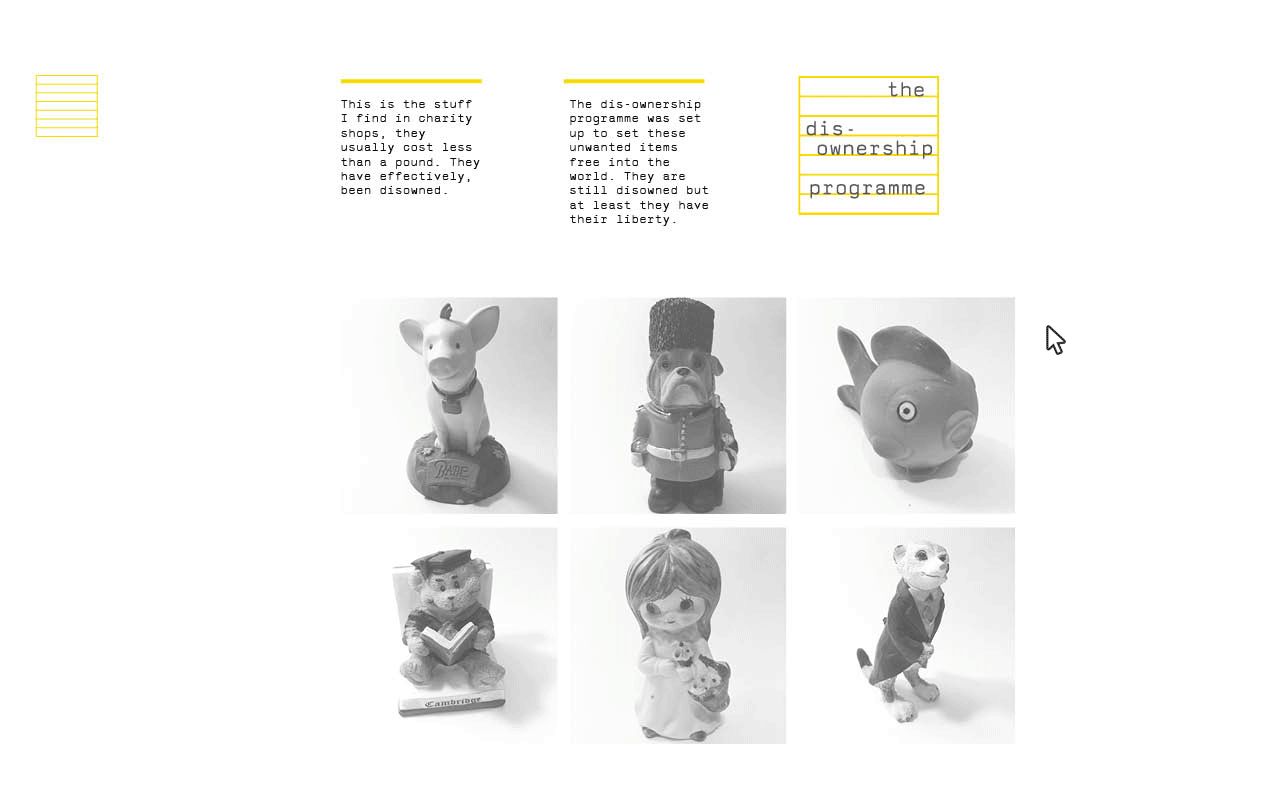
OUGD504 - Website Development


I began by photographing all of the tacky objects that I had collected. I then started editing them. I cut away the background and made them black and white. After experimenting with putting these images onto the grid with the type I decided that I wanted to keep the shadows in the background. I think the solid edges looked more effective.

I decided to use a square format for these images. Both for aesthetics and to differentiate the images from the gallery images.

I started designing the archive page but decided that it looked too similar to the home page. It was essentially the same as the homepage so I decided there was no point in it. Getting rid of this meant that I had to go back and change the menu bar.

I decided I wanted to use the yellow in most of my interactivity so I started experimenting with how I could do this.

I wanted to keep the website really simple and stripped back however I think this contact page is too simple. I realised that I had been designing for a monitor that wasn't widescreen so I had to set up a new document with the correct dimensions. I also set up a baseline grid incrementing every 14.4pt's, as I wasn't using wireframes I wanted some kind of horizontal guides. I set all the type to sit on this grid.

I redesigned the page and set up a 16 column grid with 40mm margins. When I applied all the content I felt the spacing worked much better. I decided not to have the images touching. I felt that aesthetically it looked better and the space somehow made the items look more desirable.

I decided that the contact us page was too plain. I also decided that I didn't particularly like the typeface in all caps. I changed it to the lowercase to improve consistency across pages. I wanted to put links on for social networking sites but I didn't want to use the logos. I wanted to ensure I kept the page as simple as possible. I decided to use highlighted text for the buttons to differentiate from the rest of the type. When hovering over these buttons the colours will invert.

This was my initial design for the gallery page. I was going to keep it simple with a normal scrolling function but decided against this.

A one page layout will make each image seem more important. I would like the images and type all to scroll off the page in different directions and then scroll back in as the next images and copy. I understand this will be difficult to code so I may have to settle with a more simple transition.


I was fairly happy with how the design of my pages was going. However I felt the logo design didn't look right for some reason. This was one of the things that I bought up during the final crit and the group feedback was that it may be because the rectangle didn't look right with the square format of the rest of the page. I changed the logo, tried a few slight variations and very quickly came up with a solution. This logo looks better aesthetically and includes the same type as the rest of the page. The concept is also much stronger; the arrangement of the type is intended to signify the items on the shelves.


I experimented with some different positions for the logo and a few different colour variations. After feedback and deliberation I decided on the version directly above.
I made a gif on photoshop to show the different states for the clickable objects on the homepage.