I started the ideas stage of the project by listing the key points of my partners personality. These were, hard working, precise and neat, smart and clean cut, control freak and a passion for house and techno music.
One of my initial ideas, which i spent a while doing sketches for (a couple shown above) was incorporating sound waves into my letterforms. Although I did like the way this could look visually I felt the concept was far too obvious and had no depth.
I started thinking about Josiah's love of Scandinavian design and how he intends to live in Oslo one day. I wanted to incorporate this so I spent some time on various design websites looking at Scandinavian design. Although I did really like the style of the scandinavian design I looked at, it was not this that gave me inspiration. One thing I noticed was the use of umlauts. I researched into these further, looking at both accented vowels and umlauts. I found out that accented vowels are not used in scandinavia so focused just on the umlauts. I intended to uses at least one of these glyphs once i had come up with the design of the final piece. One of the glyphs that I liked was the o with the diagonal strike through. This gave me the idea of using diagonal lines as part of the typeface. I felt it worked for
Josiah as the idea not only originated from scandinavian design, one of his passions but it also fit with the concept of clean cut and precise.
I wanted to incorporate Josiah's love of house and techno music into the design of this piece. I had already experimented with one idea that I had decided I didn't like. I wanted more knowledge of this genre of music to allow me more to work with. I looked online, reading about the scene nowadays of house and techno and the origins of these music forms. I came across the comparison chart shown above and this was really helpful. It got me thinking about the timing and BPM of the music and how i could incorporate measurements such as this into the design of the type.
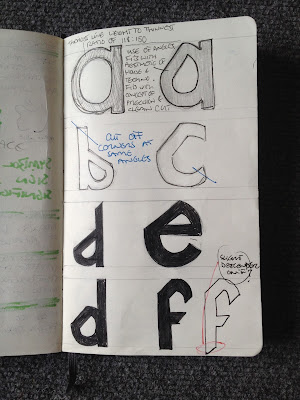
The BPM in house and techno generally ranges between 118 and 150. I decided to use these to figures as a ratio. The line weight of the diagonal strokes would be a ratio of 118:150 to the thickest line weight in the letterform. I also had the idea of incorporating the 4/4 beat that both of these genres share by splitting the image up into 4 parts. I felt I had enough ideas to start sketching some of them out.
I presented some of these sketches during the group crits. We walked round looking at each others work and leaving feedback. I got lots of feedback which i didn't find helpful. I had lots of positive comments but not much constructive criticism and I think this is partly my fault due to the fact that I did not present my development very clearly. One person told me to look at sound graphs and sound waves but this was an idea I had already tried and discarded. I had some feedback saying that they like the idea of the letterform being split into four parts but also had people saying it may affect legibility. I wasn't particularly happy with this idea anyway and if it was going to affect legibility I felt that it wasn't worth pursuing. Due to the positive feedback and lack of criticism of my diagonal lines concept I decided to pursue this.


0 comments:
Post a Comment