Showing posts with label Alphabet soup. Show all posts

Monday, 4 November 2013

Studio Brief 2 - Alphabet Soup - Illustrator


For this brief we were asked to create an alphabet based on one of the designs from the first Alphabet Soup brief. We were told to develop our letterforms further utilising Adobe Illustrator to produce our outcomes.


I started by looking at my original letterforms and trying to pick out one that would be feasible to base a whole typeface on and one that would look effective. The 3 letterforms that I liked the most were the 'e' the 't' and the 'm.' I decided that the 'm' would probably be the best to design a whole typeface on. At this point I wanted to design type that was readable and subtle and could possibly be used as body copy. I thought that basing my design on this 'm' I may produce a unique condensed typeface. 


I started developing it by doing some quick sketches of what I wanted some of the letterforms to look like. This was important as there were some letters that were difficult to manipulate in this way and it made me think in more depth about how I was going to go about it and overcome problems that I came across.


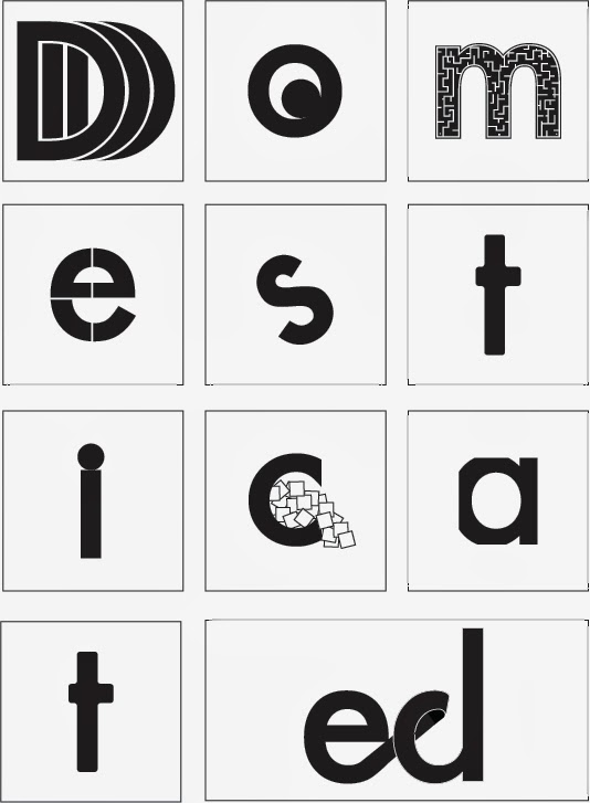
I started developing the type using the divided tool on the pathfinder menu. I used a grid to ensure that the letters were uniform. I started developing both upper case and lower case as the last typeface we designed I only produced lower case and I felt that the type seemed to be missing something. It also made it difficult to actually use practically. 
After producing a few of the letters I decided that I didn't like the type. It was a purely aesthetic decision, I felt that the letterforms still communicated the concept of closeness and confinement. I decided there was no point pushing forward with they type if it wasn't working aesthetically.
I decided that I may be able to do something more interesting if I based the type on a different original letterform. I decided to abandon the idea of making type that would be suitable for body copy. After reading the brief again I decided that I wanted to experiment with opacity. This would probably restrict the letters to being used for titles and headers only but I was happy to go down that route.


I really liked the shadows that were produced by the letter 't' that I created and decided that I wanted to look further into using these shadows. I wanted to make them cleaner and the availability of Illustrator allowed this. I did a couple of quick sketches just to see if it would work effectively but I didn't spend long sketching as I knew that the outcomes would be produced much faster if I used Illustrator.


I experimented with quite extreme manipulations as I wasn't worrying about making this readable for body copy. I decided that some problems may arise when trying to write out words with type like this so decided to experiment with making them subtler. I used the colour palette and used an 80% opacity of black and a 50% opacity along with 100% . I felt the different shades gave the impression of shadows being cast from multiple light sources. 


The manipulations I decided on in the end were really subtle. I felt that this would make the type more usable. I also felt that it fitted the concept of closeness better. I wanted the letters to look raised from the paper but only slightly to put across the closeness concept and using shadows that were really offset doesn't give off this impression. The subtlety actually makes the letters look as if they are hovering slightly. I decided that I wanted something more to this project, both to make it more visually interesting and to communicate the concept of closeness further. I experimented with using the condensed type I had started making and combining this with the shadows idea. 


I didn't like the outcome of this experiment. I decided that it was too messy and didn't work before I had even applied the colours. I did like the idea of the letterform being split into two and the two parts being close to one another though. 
I decided that using a diagonal line to divide the letters and moving the two halves away from one another rather than together would work better than moving the letters together. There would still be a small gap and this would communicate the closeness concept but it wouldn't make the letters look squashed and messy. 


I was really happy with the outcome of this experiment and decided i wanted to use this. I applied it to all of my letterforms to produce the final alphabet.


Overall I was happy with the outcome of my typeface for this brief. I felt it was aesthetically pleasing and communicated the concept well. Despite not liking the word I was originally given to base this type on (domestic) I am happy with how it has turned out.

Thursday, 17 October 2013

Alphabet Soup Design Process (2/2)

After the crits I started thinking about a way to simplify the concept that I was working with. I realised that I was trying to convey a different word with each different letter and this was the problem. I decided that one letter was not enough to convey a word, especially when I was trying to make the changes to the letters fairly subtle. I don't necessarily want to design a typeface that can be used for body copy but at the same time I don't want the changes to each letter to be over the top. 


I decided that I either needed to completely drop the concept I was working with or refine it. I did like the idea, I think it is an interesting way to approach the word domestic. I started thinking about the reasons that domestic life can be described with the words I was initially using (safe, secure, routine, slow, comfortable, restricted, laid back, loving, watched, united, close, provided for, confusing.)
After a while of throwing about a few different ideas I decided that domestic life can be described with all these words is because in a domestic environment you are living in close proximity with people who you have a close relationship with. I wanted to try and convey this idea of closeness with my letterforms. I started doing some more sketches, some of which are shown below.  


Each of the letterforms convey closeness but each in a different way. It was quite difficult to come up with different ways of manipulating type. Especially after coming up with one process that is effective, it was tempting to apply this to each letterform. However I came up with ten different variations to ensure that I met the brief. 


I started producing some of the letterforms on Adobe Illustrator. I felt that some of the outcomes looked good created digitally but I felt that with some of the pieces it would be more interesting to look at different processes. I also decided to draw some out just using pencil and fineliner as some of the manipulations were difficult to do using Illustrator. 
After looking at some work by Lobulo Design (shown here) I felt that the 't' would be an interesting letter to try creating using paper and card. I felt it would look be more tactile and be an interesting way to approach manipulation of type. Shown below is the final letterform. I used thin black card and stuck the crossbar onto the stem but raised slightly. I felt this would create some interesting shadows and the two parts of the letter not touching but being close to one another fits the concept.


Another letterform that I had created on Illustrator but had ideas for hand rendering was the 'e.' I liked the idea of the letterform being repeated directly behind the original glyph, each time getting slightly smaller. I wanted to continue with this idea. I though about using paper or card in a similar way to how I have produced the 't.' I wanted to experiment further however. I had the idea of using acetate to show the letters getting smaller each placed directly behind another. It looked effective but i felt that each sheet of acetate needed a space between them to convey the concept of closeness. I experimented with different ways of doing this. In the end I used pins and white tack to achieve the effect i was after. 


I was happy with my final outcomes (shown below) but if I had more time to work on the project I would have liked to experiment further with making 3D type. I feel that I could easily adapt some of my 2D outcomes to be 3D and they would be effective.


Friday, 11 October 2013

Group Crits


During the group Crits session we looked at everyones work and spent time analysing each piece and providing suggestions. I felt this part of the session just as helpful as the criticisms of my work. It was good to see how other people had approached their projects and this gave me a couple of ideas myself. 
After explaining my project I received some feedback, some positive and some negative. The pieces of advice and ideas I think i will build upon are the two in the middle on the images shown above. I need to think about taking away from the letters and modifying them subtly rather than adding a lot to them. I should also simplify it by taking one aspect of domestic life and focusing on this. At first i felt this was too simple but I am now starting to think that it may mean that I produce a better more concise outcome.

Thursday, 10 October 2013

Alphabet Soup Design Process (1/2)


After brainstorming the word I still hadn't come up with any ideas which I felt were strong enough to take forward. I was really struggling with how I could show domestic with type. I decided to come at it from a different angle. Possibly making it more personal to my experience with domestic life. I came up with the idea of assigning a glyph to a member of my family and trying to convey that person using the type. I felt that although this was linked with the word domestic the idea was slightly too detached from the word i was originally given. I decided maybe if I focused on one aspect of domestic life, for example the repetitiveness, It would simplify the task and also give me something easier to show visually. I decided that again this may be too tenuous a link to the word 'domestic'.

Still working with the idea of making it personal I decided that one way to approach it would be to use each letterform to put across my opinions of domestic life. I came up with a selection of words that I felt described my experience of domestic life. I also asked for the input of others however any word that i didn't feel applied to my family life I discounted. I had 12 words which i felt would be interesting to show visually. The words were: safe, routine, restricted, comfortable, laid back, loving, watched, united, close, provided for and confusing. I started sketching out some letter forms and experimenting with conveying a selection of the words.

<images>

After sketching these ideas out I was struggling to come up with anymore. I used Adobe Illustrator to mock up some of the letters to see which ones were effective and which ones weren't. This is what I intend to show in crits as i feel there is definitely still work to be done on the letters but I don't know where to go with them. Until crits i will continue researching and looking for inspiration


Monday, 7 October 2013

Alphabet Soup Briefing


Today we were given the brief for the Visual Thinking - Alphabet Soup project. We had both the module brief and the project brief explained to us. We then each picked a word out of one jar and a typeface out of another. The word i picked was 'domestic' and I got Futura as my typeface. At first I was disappointed with this word as i felt that it was quite boring and I didn't have any immediate ideas of how to convey this word through letterforms. I was pleased with Futura as my typeface as I am fairly familiar with it and would say it is one of my favourite typefaces. 


Despite my initial feelings towards the word that I was given I spent time brainstorming the word. I also looked up some alternate meanings on the internet. I managed to think of some ideas based on the word domestic that I feel I could display visually. I still have no solid idea but I feel more confident that I will be able to come up with an effective outcome. 
We also did an exercise in groups where we passed around the piece of paper with our word on and each member of the group had to write something that they associate with this word on the back. This is displayed in my sketchbook which is shown above. The exercise was really useful to see people immediate responses to the word. 
We repeated this exercise with the typeface and I don't feel that this helped anywhere near as much as with the word.