Showing posts with label OUGD406. Show all posts

Friday, 2 May 2014

OUGD406 - Speaking From Experience


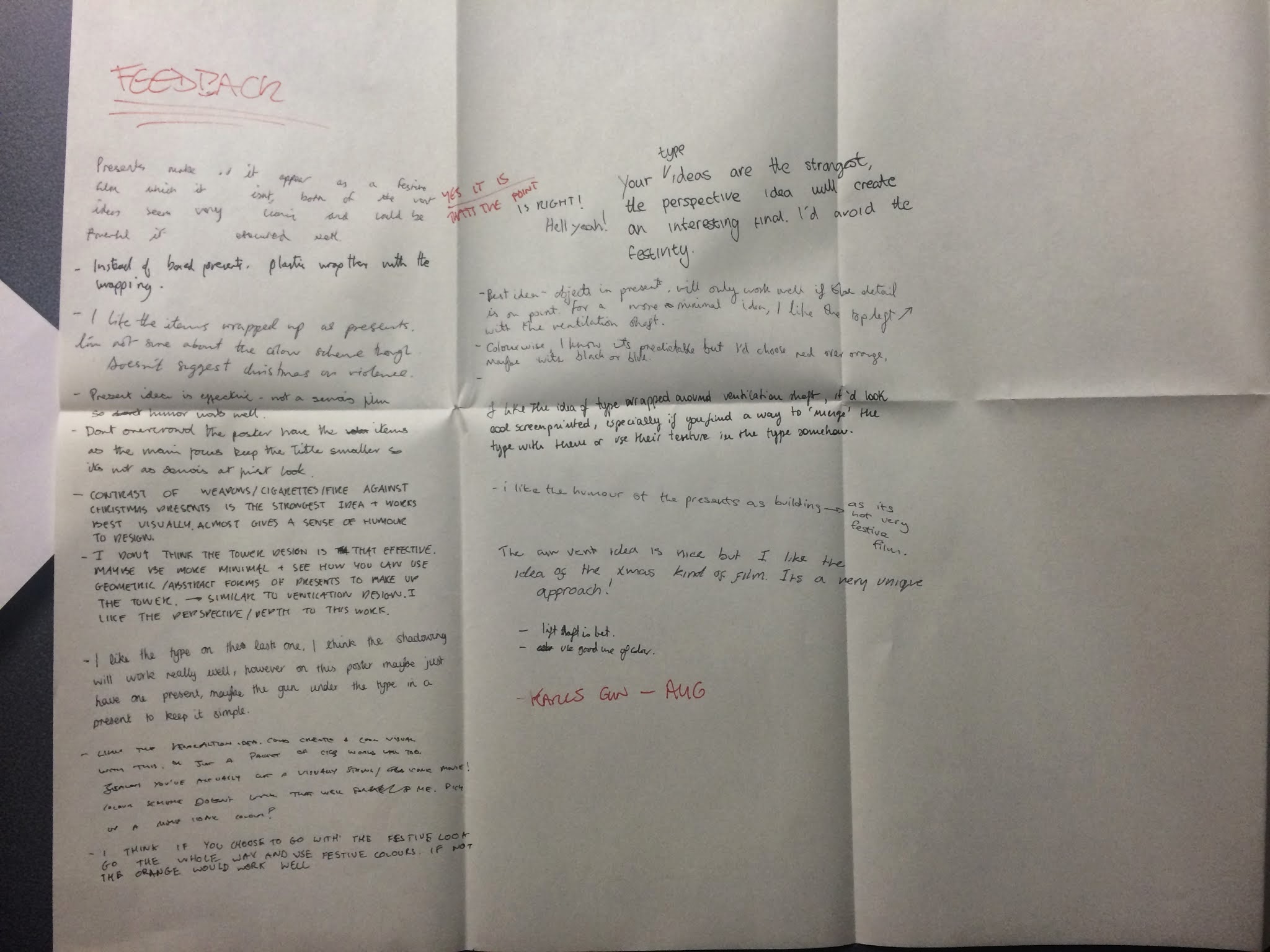
I decided for this brief that I wanted to produce something which would be helpful but also something that people would want to read. I wanted it to be relevant to first year students across the country not just LCA Graphic Design students. I wanted to produce a publication that had an interesting production feature. I wrote a brief including all of this.

Design and produce a publication that will engage new first year students and attempt to give them a taste of the type of things to expect in their first year at university. The size of the publication should be B5 and it should incorporate an experimental production feature. 
The publication should have a light, friendly tone of voice that communicates clearly with first years. There should not be any large bodies of text within the publication to ensure it will capture the attention of the students and should be humorous for the same reason.


I started mind mapping some ideas for the project and very quickly came up with a few that I was happy with. I started coming up with design ideas for the how to write about you work idea. I think I wanted to do this more because I liked the name that I had come up with for it, 'Bullshitting for Beginners.'


I decided to go with the 'First year Regrets' idea. The publication would allow first years to learn from the mistakes of people who have done first year. Shown above are some of my ideas for the publication.


I gathered content from classmates and friends who have completed first year. I used a survey to do this
initially but got few replies. I decided that asking people face to face would be the best way to do this.
I spent some time doing research, looking at the design of existing publications. Some of these are shown on my design context blog.


I used a 7 column grid for the pages. I used a 40mm margin as I wanted a large border.


I experimented with a few different typefaces. I wanted a simple sans serif typeface but because I wanted to use different weights within the quotes the typeface had to have a large choice of weights. I chose Supria Sans because it had lots of weights and because I like the way the italics are somewhere between a serif and a sans serif.


 I used a fairly heavy off white stock for the pages as there aren’t loads of pages and I wanted to book to feel substantial. The off white colour looked good against the green colours.


I decided to use the two colour blend, both for aesthetics and also to signify the changes you go through throughout first year. I was really happy with the quality of the print. I was originally planning on using orange and yellow colours for the publication but decided against this as I wanted to use the same colour blend for the type inside the pages as I did for the cover. 


I used silver ink for the type on the cover to give the book a high end look and also because it stands out against the green. 
I used two binds on either side as I wanted to separate the 'I regret not...' quotes and the 'I regret...' quotes. I justified the type according to the way I justified the content. I used the same font size and style for consistency but the justification showed the difference between the two.
I went and chose out a colour of thread that would compliment the colour of the cover. Despite this being a small detail I think it makes a difference to the overall look of 
I had some trouble with the making of the book. I made a bit of a mess of the binding and had to use glue to fix a couple of rips in the paper.  Luckily it wasn't too noticeable. I also had problems with the size of the book. I got the measurements wrong for the cover so I had to trim the book down by about a centimetre on the long edge. This made the margins uneven which I wasn't happy about. Despite these problems I am still happy with the outcome of the book. I feel it is a strong publication aesthetically and performs it intended function very well.


Saturday, 5 April 2014

Studio Brief 03 - Alternative Movie Poster (2/2)


The technician in the ceramics workshop was really helpful. I explained my idea to him and he told me the best way to achieve the outcome I was aiming for.
I cut a piece of glass to a4 size using a glass cutter and then smoothed off the edges and corners so that it wasn't too sharp. 
I then put sticky back plastic on one side of the glass. This would stop the glass breaking apart when i shattered it. It was difficult to apply the plastic without getting any bubbles in it but I managed it after a few attempts.


I used the print room at Vernon Street to print my designs. I took my positives in and exposed my screen. I needed 4 separate positives because I was printing the repeated pattern on paper and the type on the glass. I looked through the stocks that they had to offer and decided on a slightly off white textured stock called 'Somerset Textured White.'


I really enjoyed the process as I have done it a few times now and I feel I am really starting to get the hang of it. The alignment had to be perfect for these designs as each illustration is so small and the red tags had to fit directly into the negative space in the illustrations. Almost all of my prints were lined up perfectly or close enough so it wasn't noticeable which I was really pleased with.


When I was printing onto the glass I did all of my registration prints with the glass already underneath it as it is very slightly raised and even this could throw off the alignment. I taped up the edges of the glass to make sure it didn't damage the screen.


Shown above is the glass after it had been printed. It took a while to dry but I was really pleased with the way it looked.


I used a hammer to smash the glass and filmed it in slow motion. Unfortunately the slow motion video didn't transfer to my computer at the 120fps that it was filmed in. I did attempt to make a gif of the smashing. Shown above is my outcome. It didn't work out very well, there are some obvious flaws which I could fix easily but unfortunately due to the equipment I used i will not be able to achieve the desired effect.


I scanned in the final piece so I could get a flat digital image of the poster rather than it just being a physical piece. I was apprehensive that the glass wouldn't scan properly. I was really pleased with the outcome though. I have really enjoyed this project and feel that my work reflects this. Although I struggled with ideas to start off with I feel my final piece is strong and unique. 
I feel my skills with screen printing have improved drastically due to this module as well as my idea generation skills.


Monday, 24 March 2014

Studio Brief 03 - Alternative Movie Poster


For studio brief 3 each of us was given a Bruce Willis film. The film that I got was die hard which originally I was pleased about as I have seen it before on a few occasions and I immediately thought of some ideas. There is lots of iconic imagery in the film and I was sure coming up with a strong idea wouldn't be too difficult. 
I sat down and watched the film and wrote down some of the ideas that I had whilst watching it whilst also jotting down lines from the film and some things that I thought would be iconic and I would be able to do something with. I was planning on doing something with broken glass originally as this is a recurring theme throughout the film. I decided to look at some alternative movie posters on the AMP website to see what was already out there. I also searched online for alternative Die Hard posters. I found a huge number of alternative posters for the film but this wasn't surprising considering its popularity. I have displayed some of my favourite posters here, on my design context blog.
A lot of the ideas I got when watching the film have already been done which was irritating as I wanted the design to be original.


Shown above are 4 of the ideas that I had. My favourite ideas were the ones that involved Christmas as I haven't seen any posters that incorporate this theme despite Die Hard being a Christmas movie. People don't normally think about it in this sense because it is a very unconventional Christmas film. I showed these designs at the interim crit and got a lot of feedback which backed up my own opinions on the designs. One piece of feedback that I got from a few separate people was that If i was going to go with the Christmas theme then I should use a colour more appropriate to this. I decided to use black and red instead of orange. This is not only a festive colour but also represents danger which is perfect for the film. 


The design that the majority of people liked the most was the one with the illustrations of the items he finds throughout the film wrapped in presents. Not only did people say they thought this would be the most aesthetically pleasing but they also felt it was the strongest conceptually and I agree. I had already done a couple of the illustrations to use in this design which are shown on the same page. I drew a walkie talkie and a roll of tape as well as these are two more items the main character finds throughout the film.


After drawing out all of the items I put them into Photoshop, edited the levels and curves and then Image traced them in Illustrator. I liked the line quality that this gave the images. Shown below are the illustrations after I image traced them.


I was happy with the illustrations, the gun in particular. I ensured that I drew the actual gun in the film (an MP5) as I thought this would give it authenticity.  A better quality image of this illustration is shown below.


I experimented with illustrating presents to lay over the illustrations like I did in the plan but I didn't like the combination of really clean vectors with the hand drawn illustrations. I also felt that they obscured the illustrations too much. I decided instead to draw tags on the drawing to keep the Christmas theme and the whole idea of the objects that John McClane finding being presents. As I had already drawn out the illustrations I didn't want to have to go back and redraw them with tags on. Instead I drew the tags on tracing paper directly over the original illustrations to get the proportions right. 


I then went through the same process as with my previous drawing, editing them in Photoshop and then image tracing them. I wasn't sure how difficult it would be to line them up properly but it was much easier than i expected. 


I decided that instead of just laying the illustrations out how I had in the plan it would look good if I used them as a repeated pattern. I also felt that this might look like wrapping paper which again backs up my Christmas theme. 


I used Gotham bold italic as the typeface and halftoned it as it distracted away from the illustrations when I used block colour but I still wanted a bold typeface. I felt that the design was strong but I came up with an idea of how to develop it even further. 
I still want to incorporate broken glass into the design and I was considering fragmenting the design as if it was printed onto glass that was then broken. I decided that it would be much more interesting  and effective to actually do this in real life as a lot of the posters already use broken glass and taking this literal approach to it would be really unique. The photograph below shows what gave me this idea, it was a shop front with shattered glass.


I remade the repeated pattern without any type. I intend to screen print the type onto glass and then break this and lay it over the design shown above. I think that giving the design layers like this will add texture and depth to the piece and make it unique. I am unsure of how I will go about doing this but I will speak to technicians in college and find out what the best way is. 


Wednesday, 19 March 2014

OUGD406: Communication is a Virus (2/2)


Before we could release the zine we had to ensure that we had a presence online. We set up a twitter page which we put all of our content on and as a group we made a conscious effort to tweet news as we saw it.


In the days running up to the release of the zine we put out posters with headlines from that day around universities and colleges in Leeds. We printed these on the same news print that we intended to use for the zines. We made the posters really simple using the typefaces we had used within the zines. This helped to improve overall consistency. We decided to use a blue very similar to the blue used in the design of twitter for two main reasons. As our project was focused a lot around twitter it worked in this way. But we also felt it would be interesting to use blue as it is contrasting to the red usually associated with tabloid journalism.


We decided to use spray paint to add colour to the posters as this would make each poster individual and this added to the limited edition idea we were trying to achieve with the zines.


I borrowed a Canon 5d from my friend and then borrowed a Rhode field Mic and a tripod from college. I spent some time experimenting with the equipment and learning how to use it properly the night before we went out to shoot the video. We decided to ask people about the situation in Ukraine as this was such a serious issue it would be interesting to see if people were ignorant about the subject. We decided to compile together the hesitation noises that people made to try and make the video humorous as people would be more likely to share it.


We printed the zines using heavy newsprint. We wanted something fairly durable so normal newsprint wouldn't have sufficed. We still wanted the newsprint look as this is essentially a news zine so it makes sense. We used the photocopier to produce the zines as it was very cheap, something that was important seeing as we originally intended on producing 140 copies.


Using the laser cutter we got some woodblock stamps made. There were a few complications but with the help of the technician we produced 2 stamps of different sizes.


We experimented with printing the stamps with different inks. The oil based inks worked the best but as we were intending on releasing the zines that day we couldn't use these due to the drying time. 


We dropped the zines around Leeds in various different places and I have spoken to a few people from Leeds College of Art who have picked up the zines and were really impressed.


Me and the group are really happy with the way that the zines turned out. Not only were they aesthetically pleasing but also included informative content. It would have been great to continue with this project but unfortunately it is too labour intensive to continue whilst studying on the course. We are considering trying to get more people involved to reduce the workload. We have had good feedback from many different sources. My cousin has a friend who works at Vice and he showed the project to people in his office. Apparently they were all impressed with the idea and the outcome. It is good to get good feedback from people who work in the journalism industry. 
I have really enjoyed working as a group and feel everyone came together well. We communicated clearly and weren't scared to give honest feedback. Everyone worked hard and pushed themselves and I would be more than happy to work with this group again.


Wednesday, 26 February 2014

OUGD406: Communication is a Virus (1/2)


We were given this brief and assigned our groups. Each group was given a starting point for the project. Our viral campaign would try and encourage people to read more. We spent time thinking about which area to look at and how to specify this brief. We thought about various different areas but the two we liked the most were encouraging people to read news and encouraging people to read novels. We decided that looking at current events had more scope as to what we could do for a viral campaign. As a group we had more ideas for this and stronger ideas. We went away and individually did some research that would inform the creation of this campaign.

Some of my initial research is shown here on my design context blog.


Shown above are the notes that I took when we all got together as a group after going away to do some research. We decided that our target audience was students in Leeds as this was accessible to us.


Josiah bought in a publication called the week which aims to provide unbiased coverage of the news from that week. This was something that really helped us to form our ideas.

We thought about what our outcomes could be and decided upon a zine, a video, a twitter account and possibly posters. We wanted the zine to include a summarised, unbiased report on some of the top stories from that week. The zine would include illustrations to accompany the reports and would encourage readers to get involved by giving their opinions via twitter. We felt that the combination of multiple platforms would appeal to the target audience of students and encourage people to respond to the publication, thus increasing our web presence. 

We spent time thinking of a name for the campaign and the publication. We decided we wanted to focus on the aspect of everything being on twitter within the name. 144 news was the one of the leading contenders for the name as we originally thought twitter allowed 144 characters. That night I spent time coming up with some logo ideas. Shown below is one of the ones that I liked best.


When we next met up we realised that twitter in fact allows 140 characters. I showed the logo anyway as it would be easy to change to 140 news. Although the group liked the logo they said that they felt it looked too much like an official news channel and we were going for a more friendly image.


We spent time as a group coming up with new ideas for the name of the zine and twitter page. We decided on 'One40' after experimenting with different ways to format this name. We felt it rolled off the tongue, was memorable, fitted with the idea of the twitter characters and the combination of letters and numbers made it more visually interesting.
We thought about the format of the actual publication and toyed with the idea of showing two contrasting sources and giving our own unbiased overview. We decided that finding two contrasting sources for each story might be too difficult. We decided instead to write our own short summaries that were under 140 words long. This fits with the name and although we realised it would be difficult to inform people of all the important details in this format we decided this wasn't that important. The aim of our zine was to get people interested in reading more and after seeing our zine they could go and research further if they chose to. 140 words isn't an intimidating body of text so more people would happily read it and this may spark some interest. 
Deciding on the name started some interesting discussion and we thought of some ideas which as a group we all liked. We decided that we would print 140 copies of the zine and also have it avaliable online. Each zine would be stamped with the logo which we decided would have a forward slash in front of. This was we could number each copy and people would know which issue number they picked up. This would provide an element of exclusivity which we thought might build hype. 


We decided to have the zine split into different sections in the same way that a newspaper would be. The sections we decided upon were; World, UK, Strange, Tech, Sport and Politics. 

We also came up with a mission statement which summed up the purpose of One40.

 "One40 is an Illustrated zine that aims to provides students in Leeds with an informative, balanced and concise overview of current affairs.'


After compiling and distributing the news stories that we decided to use as content we all went away and wrote tweets for the stories that we weren't going to feature. We also had to write two articles under 140 words on the featured stories as well as doing illustrations to accompany these. The featured stories I got were the Uganda Anti-Gay Bill and the Legal High; Doxylam. My illustrations for these stories are shown below.


My idea for this illustration came after seeing some of the posters that Ugandan citizens were using to protest for the Anti-Gay bill. I felt that some of them were so ignorant that compiled they would illustrate the ridiculousness of the situation. I drew the illustration by hand and then scanned it in and edited it in Photoshop

This is the Illustration that I did for the Doxylam story. I wanted to shock people by really pushing the fact that Doxylam is a legal high. I decided to do this by showing it being sold in a way that is an accepted part of our society.


We compiled all of the stories and illustrations into the zine. As a group we decided on a minimal layout and chose the typefaces Leberkass Grotesque and Apercu. We also decided on the final version of the logo. 


Josiah put all of the content into the framework and uploaded the PDF to issuu so people could access it online.