Monday 24 March 2014

Studio Brief 03 - Alternative Movie Poster


For studio brief 3 each of us was given a Bruce Willis film. The film that I got was die hard which originally I was pleased about as I have seen it before on a few occasions and I immediately thought of some ideas. There is lots of iconic imagery in the film and I was sure coming up with a strong idea wouldn't be too difficult. 
I sat down and watched the film and wrote down some of the ideas that I had whilst watching it whilst also jotting down lines from the film and some things that I thought would be iconic and I would be able to do something with. I was planning on doing something with broken glass originally as this is a recurring theme throughout the film. I decided to look at some alternative movie posters on the AMP website to see what was already out there. I also searched online for alternative Die Hard posters. I found a huge number of alternative posters for the film but this wasn't surprising considering its popularity. I have displayed some of my favourite posters here, on my design context blog.
A lot of the ideas I got when watching the film have already been done which was irritating as I wanted the design to be original.


Shown above are 4 of the ideas that I had. My favourite ideas were the ones that involved Christmas as I haven't seen any posters that incorporate this theme despite Die Hard being a Christmas movie. People don't normally think about it in this sense because it is a very unconventional Christmas film. I showed these designs at the interim crit and got a lot of feedback which backed up my own opinions on the designs. One piece of feedback that I got from a few separate people was that If i was going to go with the Christmas theme then I should use a colour more appropriate to this. I decided to use black and red instead of orange. This is not only a festive colour but also represents danger which is perfect for the film. 


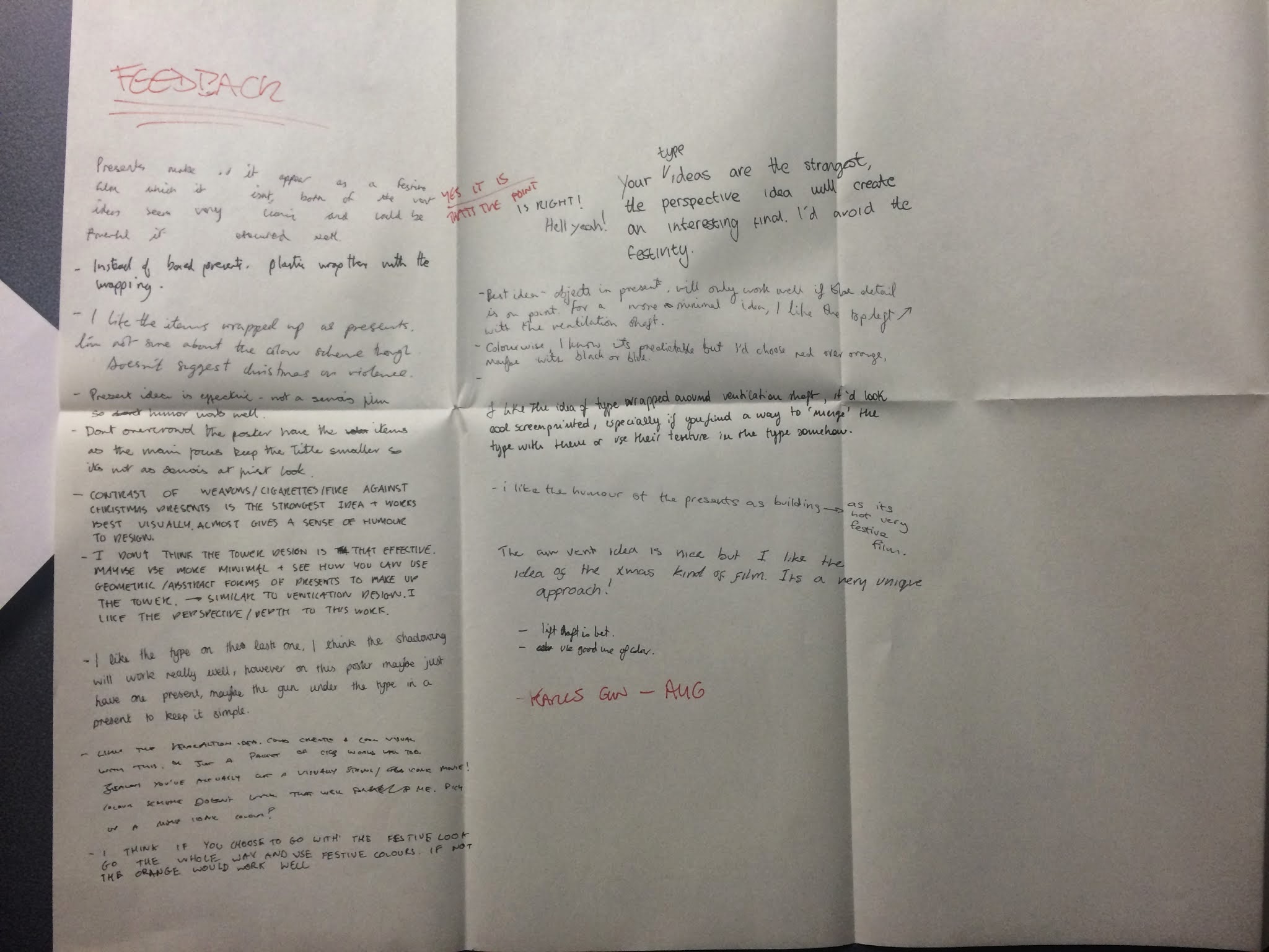
The design that the majority of people liked the most was the one with the illustrations of the items he finds throughout the film wrapped in presents. Not only did people say they thought this would be the most aesthetically pleasing but they also felt it was the strongest conceptually and I agree. I had already done a couple of the illustrations to use in this design which are shown on the same page. I drew a walkie talkie and a roll of tape as well as these are two more items the main character finds throughout the film.


After drawing out all of the items I put them into Photoshop, edited the levels and curves and then Image traced them in Illustrator. I liked the line quality that this gave the images. Shown below are the illustrations after I image traced them.


I was happy with the illustrations, the gun in particular. I ensured that I drew the actual gun in the film (an MP5) as I thought this would give it authenticity.  A better quality image of this illustration is shown below.


I experimented with illustrating presents to lay over the illustrations like I did in the plan but I didn't like the combination of really clean vectors with the hand drawn illustrations. I also felt that they obscured the illustrations too much. I decided instead to draw tags on the drawing to keep the Christmas theme and the whole idea of the objects that John McClane finding being presents. As I had already drawn out the illustrations I didn't want to have to go back and redraw them with tags on. Instead I drew the tags on tracing paper directly over the original illustrations to get the proportions right. 


I then went through the same process as with my previous drawing, editing them in Photoshop and then image tracing them. I wasn't sure how difficult it would be to line them up properly but it was much easier than i expected. 


I decided that instead of just laying the illustrations out how I had in the plan it would look good if I used them as a repeated pattern. I also felt that this might look like wrapping paper which again backs up my Christmas theme. 


I used Gotham bold italic as the typeface and halftoned it as it distracted away from the illustrations when I used block colour but I still wanted a bold typeface. I felt that the design was strong but I came up with an idea of how to develop it even further. 
I still want to incorporate broken glass into the design and I was considering fragmenting the design as if it was printed onto glass that was then broken. I decided that it would be much more interesting  and effective to actually do this in real life as a lot of the posters already use broken glass and taking this literal approach to it would be really unique. The photograph below shows what gave me this idea, it was a shop front with shattered glass.


I remade the repeated pattern without any type. I intend to screen print the type onto glass and then break this and lay it over the design shown above. I think that giving the design layers like this will add texture and depth to the piece and make it unique. I am unsure of how I will go about doing this but I will speak to technicians in college and find out what the best way is. 


Wednesday 19 March 2014

OUGD406: Communication is a Virus (2/2)


Before we could release the zine we had to ensure that we had a presence online. We set up a twitter page which we put all of our content on and as a group we made a conscious effort to tweet news as we saw it.


In the days running up to the release of the zine we put out posters with headlines from that day around universities and colleges in Leeds. We printed these on the same news print that we intended to use for the zines. We made the posters really simple using the typefaces we had used within the zines. This helped to improve overall consistency. We decided to use a blue very similar to the blue used in the design of twitter for two main reasons. As our project was focused a lot around twitter it worked in this way. But we also felt it would be interesting to use blue as it is contrasting to the red usually associated with tabloid journalism.


We decided to use spray paint to add colour to the posters as this would make each poster individual and this added to the limited edition idea we were trying to achieve with the zines.


I borrowed a Canon 5d from my friend and then borrowed a Rhode field Mic and a tripod from college. I spent some time experimenting with the equipment and learning how to use it properly the night before we went out to shoot the video. We decided to ask people about the situation in Ukraine as this was such a serious issue it would be interesting to see if people were ignorant about the subject. We decided to compile together the hesitation noises that people made to try and make the video humorous as people would be more likely to share it.


We printed the zines using heavy newsprint. We wanted something fairly durable so normal newsprint wouldn't have sufficed. We still wanted the newsprint look as this is essentially a news zine so it makes sense. We used the photocopier to produce the zines as it was very cheap, something that was important seeing as we originally intended on producing 140 copies.


Using the laser cutter we got some woodblock stamps made. There were a few complications but with the help of the technician we produced 2 stamps of different sizes.


We experimented with printing the stamps with different inks. The oil based inks worked the best but as we were intending on releasing the zines that day we couldn't use these due to the drying time. 


We dropped the zines around Leeds in various different places and I have spoken to a few people from Leeds College of Art who have picked up the zines and were really impressed.


Me and the group are really happy with the way that the zines turned out. Not only were they aesthetically pleasing but also included informative content. It would have been great to continue with this project but unfortunately it is too labour intensive to continue whilst studying on the course. We are considering trying to get more people involved to reduce the workload. We have had good feedback from many different sources. My cousin has a friend who works at Vice and he showed the project to people in his office. Apparently they were all impressed with the idea and the outcome. It is good to get good feedback from people who work in the journalism industry. 
I have really enjoyed working as a group and feel everyone came together well. We communicated clearly and weren't scared to give honest feedback. Everyone worked hard and pushed themselves and I would be more than happy to work with this group again.


Monday 10 March 2014

Yoke Leeds - Dialogue


Shown above is my submission for the Yoke Leeds Dialogue brief. After some mind mapping I decided to focus on the most simple dialogue that we hear everyday and don't even think about. I thought about slang and stuff that I personally say regularly along with other people. I decided to use the phrase 'alright mate' as this is something that many of my friends and other people I know say everyday. It is so mindless we never really even think about it. It's a question but is often not treated as such. Many people often respond to it by asking the exact same question or with a form of greeting. 
I decided to incorporate the thumbs up into the piece as I feel this is also very simple everyday dialogue between people.
I did not think about putting a tattoo into the piece until I went to photograph my friends arm. I considered using someone else but decided that the tattoo would give the halftone image more texture. I suppose tattoos in themselves are a form of communication as well, it is someone expressing who they are as a person so this fits well with the title Dialogue.
I decided against using a typeface and opted for stamping the letters with my thumb print as the image is a thumbs up. I feel this has worked well and is probably the best thing about the piece.

Sunday 2 March 2014

Design Principles - Grids 2


Today we drew out thumbnail sketches of page layouts to try and gather some initial ideas for the double page spreads we will be designing. The process helped me to think about interesting ways to lay out a combination of images/diagrams, body text and headings. 


I started the process by drawing out a rectangle of 34cm x 24cm. I then drew a diagonal line from the top left corner to the top right.


I used the diagonal line to draw a smaller rectangle of the same proportion with a top edge of 7cm. I then traced this rectangle numerous times and drew in margins, gutters and columns. 


I was then able to experiment with different columns, headings and images. Shown above are the sketches.