Monday 27 April 2015

OUGD505 - SBO2 - The Shallows

I decided upon Nicholas Carr's 'The Shallows' as the book to redesign the cover for for studio brief two. The books subject really interested me and also ties in with the issue I am tackling for studio brief one. I began by mindmapping the topics in the book. This immediately gave me some ideas for how to display this visually. I then drew out thumbnails of some of the better ideas that I had.


I wasn't sure which idea I wanted to move forward with so decided to experiment with a few and see which was most effective.


One idea I had was to make a stencil of a brain and spray bleach through this onto paper or cloth. I would then immerse the bottom part of the canvas in bleach and hopefully the ink would run making what looked similar to a tide mark. This links back to the title, 'The Shallows'


I experimented with a piece of blue fabric and two different paper stocks, There is only one way to describe the outcome and that is a catastrophic failure. The bleach had little or no effect on all three materials that i tried out. I intend to look further into this, maybe using spray paint or watercolours to achieve the desired effect.


To communicate the internet aspect of the book I decided to use a combination of code and keyboard keys. I was pleased with the outcome of this and will also experiment further with these elements. Possibly combining the two ideas. 


OUGD505 - Amélie Petit Moreau


I came across these experiments by Amélie Petit Moreau. Her work spans across multiple disciplines but these digital experiments with linocuts really stood out to me. The combination of traditional media and with the glitchy digital aesthetic creates some really nice textures. I may look into combining traditioal and digital media in a similar way. This has inspired me for both studio brief 1 and 2. 

Friday 24 April 2015

OUGD505 - Disconnected

I came across this video for a project tackling exactly the same issue as I am for studio brief 01. The project is called 'DISCONNECTED' and some of the results are really interesting.


DISCONNECTED Jan2015 from erin cotter on Vimeo.

Thursday 23 April 2015

OUGD505 - Further Experimentation


After seeing this poster for black mirror I decided to try and achieve a glitchy fragmented effect but using physical processes.


I cut this image up and then pieced it back together, I altered the hue and saturation to achieve some really nice colours and an effect that is really creepy. I feel using slightly disturbing imagery such as this may be appropriate for my project; it will catch attention and give negative connotations towards overuse of technology.


OUGD505 - Experimentation

I wanted to start looking at processes to achieve a lo fi style, similar to some of the designers I have been looking at and reminiscent of punk flyers and posters. 


Using secondary images from magazines I created a simple collage depicting a group of friends with phones on their heads. The idea does convey the message I want it to but in a really obvious way. This is just for experimentation purposes so I didn't labour over the actual imagery.


I transferred the image onto tape, the outcome was a bit too messy and it was difficult to tell what it was. I may look into this process again but will use an image with higher contrast. 


I photocopied the image and then scanned it in. I manipulated the image in photoshop, changing the colours and applying a halftone effect. I used tape and wrote the slogan that I think I may use for this project on it by hand. I then scanned this in and incorporated it into this image. The outcome is nothing special but it is my first attempt at experimenting with processes such as these.


Wednesday 22 April 2015

OUGD505 - Dustin Kilgore


Last term we did a workshop looking at the reappropriation of imagery. I really enjoyed the workshop and was pleased with my outcome. This inspired me to look for designers who reappropriate imagery in their work, especially imagery relevant to social and political issues in the modern day.

Dustin Kilgore combines this method with a wry sense of humour to create some interesting work.
His work has inspired me to experiment further with this method of image production and possibly to use it within this project.


OUGD505 - Wojciech Fangor


The integration of black and white photography, type and paint in Wojciech Fangor's posters creates a really striking visual. A lot of his work is used to advertise films but I feel this style would be perfect for propaganda posters. It immediately catches your attention and will be easily achievable without using a computer. 

OUGD505 - Jamie Zuverza


Jamie Zuverza is a designer from El Paso in Texas. I came across an interview with him on itsnicethat.com  which was really interesting and inspiring. The attitude he has towards the way he works and life in general is refreshing and fun. The visuals that he produces really inspired me with this project and gave me ideas of how to move forward.


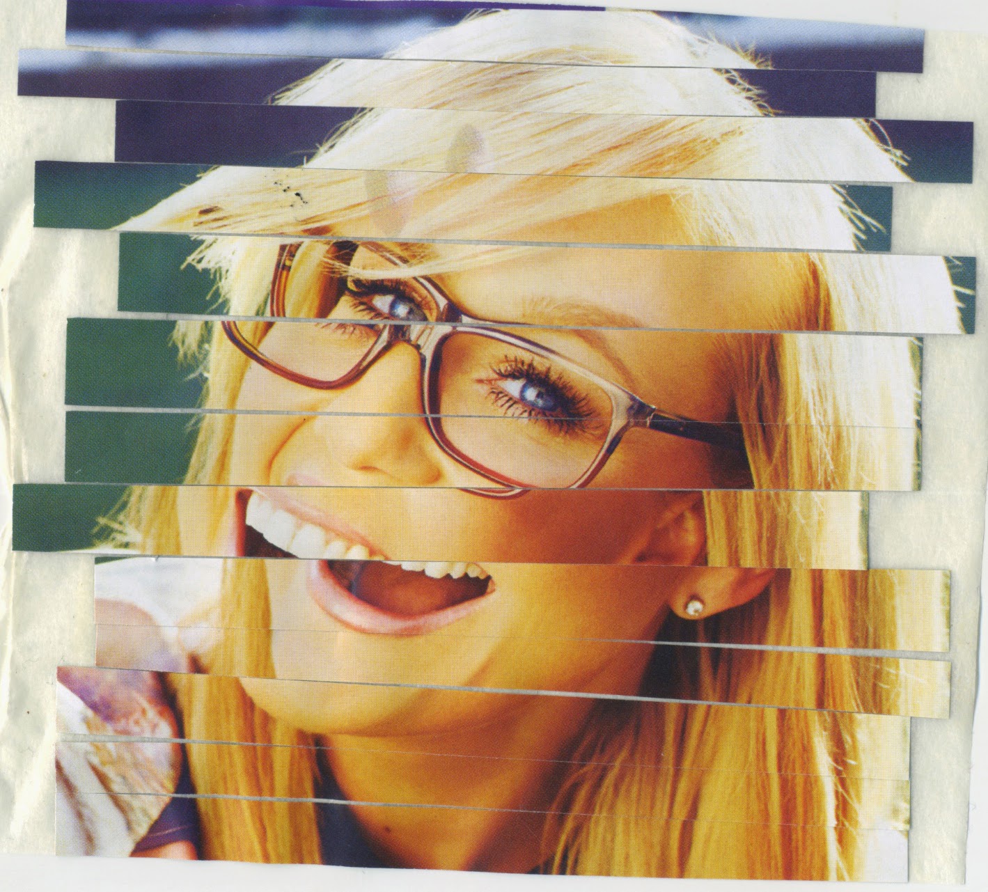
I have spent a lot of time trying to come up with really original, revolutionary ways of tackling the social issue I have chosen (technology ruining human interaction) but to no avail. The visual impact of these posters made me realise that poster design has been used for years to try and change social and political situations and this is for one very simple reason... it works.


I read a couple of interviews with Jamie Zuverza. In an interview with creative commision he is asked about how he goes about creating his designs and how much of it is derived from the computer.

'What do you use for your designs, how much of it is computer based and what are thoughts on digital?
I use Photoshop, printed material, the internet, pencil, paper, and a scanner. I have no negative thoughts on digital (except the tendency it produces to explore no further than the infinite virtual world) although I do try to be negative about it. I think what a design can convey is more important, in my opinion, than its origin. I’d rather put some sort of idea or sentiment in a person’s head, than just hypnotize them with technique or style. Either way I’m gonna try to distance myself from the computer and start drawing and painting more while standing, but only because my nalgas have gotten pretty flat.'

His answer made me realise that one of the reasons I was so drawn to his posters is due to the fact that they use a lot of traditional media and steer clear of clean computer generated graphics. This use of traditional media relates to the issue I am trying to tackle. Maybe avoiding using the computer when producing my outcomes would make them more relevant to the topic.
I have decided to look further into poster design which utilises various different medias. I may look at producing a set of propoganda posters generated in this way to try and instigate change. This may be slightly too simple to justify an entire project but I feel it's a good starting point. The project will expand as I move forward