Friday, 30 October 2015
The National Fitness Network
Working with Poppy Young, a fellow member of Goat Collective we were tasked with rebranding 'LFX' a fitness networking company. They are completely changing the name and want a new logo design and brand specs to accompany.
Brief - The National Fitness Network
I am looking for something ‘strong’ and vibrant that reflects the potential size and scale of a national network for people working at all levels of the UK (England, Scotland, Wales and Northern Ireland) fitness industry.
Something that could appeal to a senior manager/executive or a newbie personal trainer or exercise instructor.
It needs to look current in terms of font etc but must retain an air of professionalism and respectability.
I am particularly interested in having a unique brand ‘mark’ which in time will come to represent the network and will ultimately stand alone. So this needs to be significant and memorable from the moment it is seen!
With regard to colour and style etc I am open to all suggestions as I have nothing in my mind that would influence a designer. I much prefer for a designer to be as creative as possible and then review things over time.
Current logo


The brief is shown above, the client left it fairly open but provided some good information to work from.
We began by doing some simple sketches, from these we decided that using a heart rate beat was a fairly strong concept and we wanted to run with this. We had a few compositions in mind from our sketches but due to the angular nature of the forms we moved onto Adobe Illustrator to develop the logo further.


As the brief defines the mark should be 'unique' and 'significant and memorable'. For this reason we wanted to keep a really clean aesthetic. We saw an opportunity to incorporate the mark we developed with the type. This would mean the type sitting at a 45 degree angle however we saw this as a positive thing. The uncommon placement made the logo more memorable, more forward thinking and also added a sense of movement (directly relating to the company's focus on fitness).


We decided to use a Sans Serif typeface as the client specified he wanted it to look current and retain an air of professionalism. After trying a few fonts we settled on DIN bold. The slightly square aesthetic worked well on the angle and was consistent with the structure of the 'N's'. The use of wide tracking makes the type look less static and balances the composition.


A tapered line made the logo yet more dynamic and added connotations of speed. It also made the 'N's' more apparent as they seem to be separated from the rest of the line slightly.

After some futher experimentation we decided that within the icon form of the logo the N's should sit on one baseline. It is still essentially the same logo and is very obvious that it is a partner of the wordmark but aesthetically looks more balanced. We feel this slight nuance adds to the overall identity of the company and makes the mark more transferrable.


We spent some time deliberating the colour scheme we would propose with the logo, eventually deciding that the logo should be displayed in black against white for the primary promotional material e.g. business cards and letterheads. Colour could be added to the logo depending on its application and appropriateness. Shown above are some of the colour options we displayed. This was just to illustrate the versatility in regards to colour.
Throughout the process me and Poppy worked closely with one another. Every decision we made was a joint one. We developed and discussed every stage together. This is one of the first corporate briefs we have completed under Goat Collectives name and are both happy with the outcome.
Shown below is the Re brand proposal submitted to the client including mock ups.
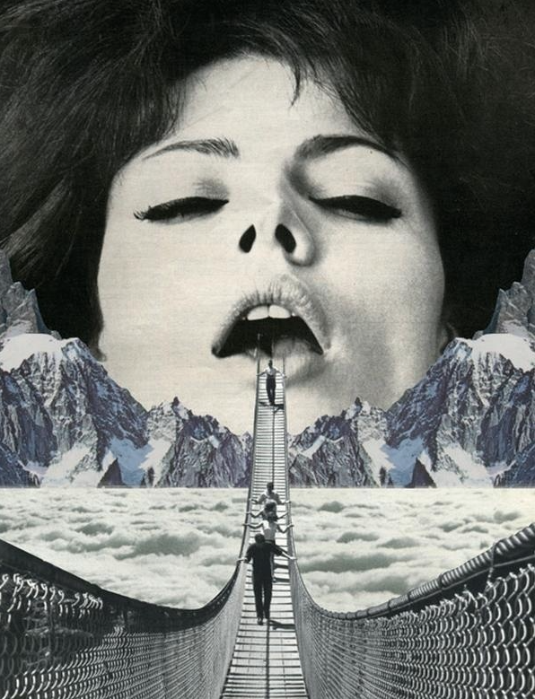
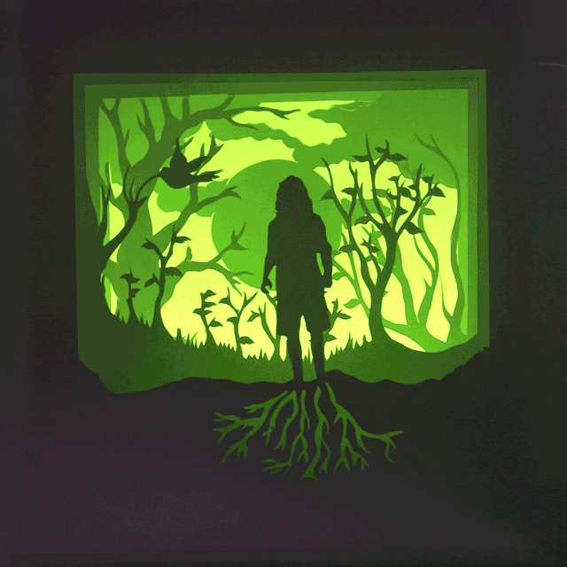
Sunday, 11 October 2015
Dr Me Workshop Prep
Tomorrow design duo, Dr Me are coming to do a workshop with the class. I have collected some material to collage with. I also decided to look online at Dr Me's work, specifically pieces from their 365 days of collage studio project. I'm looking forward to work with this medium as aI have always enjoyed it in the past but never really spent much time on it. Below are some collage pieces I have been looking at for inspiration. I particularly like the pieces that link almost seamlessly to create one highly contrasting image.