Wednesday, 29 January 2014

Design Principles Colour Theory Task


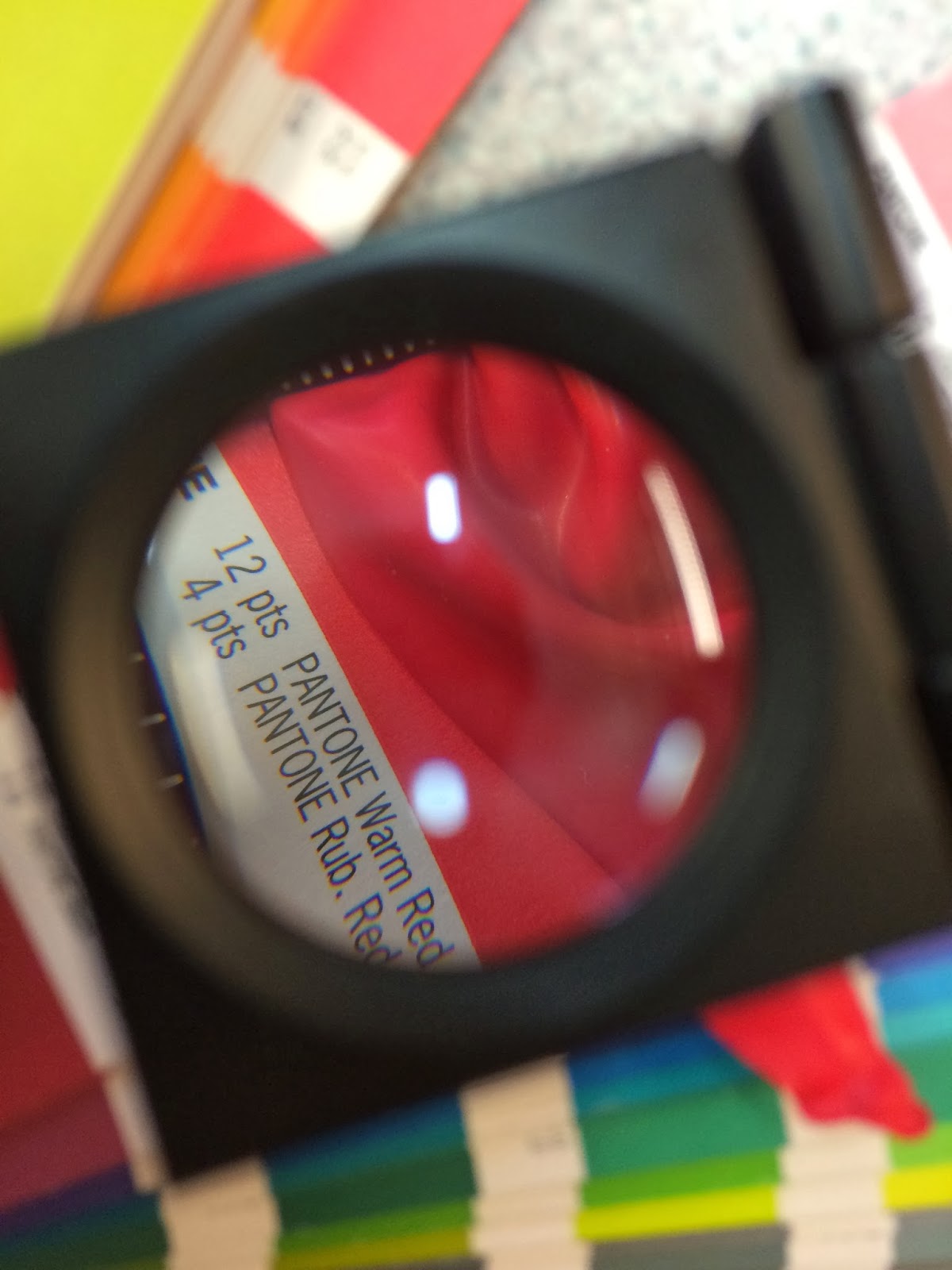
After learning to use linen testers and looking at the colour separation on some prints we were told to colour match the paper and the objects that we were using with pantone swatches.


We made a note of the Pantone number for each colour.


I then went onto the Pantone website and used the colour finder system to get a swatch of each colour. I screenshotted these swatches for use later on.


I then made a grid of 20 squares in Illustrator. I imported the screenshots of the swatches and used the eyedropper tool to fill the squares with the correct colour, I used the same pantone colour as the paper we used for these squares.


I then used the offset path tool to make smaller squares inside the current ones. I again used the eyedropper tool and made these the colours of the objects that we put against the paper during the studies we did in class.


The smaller squares are the colour of the objects and the larger squares are the colours of the paper. I then put these recreations next to photographs of the objects. This is shown on a PDF here.

Wednesday, 22 January 2014

OUGD405 - Studio Brief 04 - Communicate [2/2]

I decided I wanted to tie my double page spreads and the app design for 'Phitograph' together. I decided to use the same colour scheme and typeface as I felt it would work well for the app as well as the double page spreads. 


I started by creating the grids on illustrator. This was a very precise process and involved lots of maths to get the proportions perfect. The one that i struggled with most was the grid with the spiral. Getting the curve of the spiral to be even was fairly difficult. I also designed a pop out box which would be used for the interface of the app.


I then mocked up the interface using illustrator. I spent time thinking about how I could tie the design of the app into the golden ratio. The shutter button uses two concentric circles based around the fibonacci numbers. The curved corners on the pop out box are made using different sized circles, again all of these are based on fibonacci numbers. And the main body of the camera icon (used to change the app to front camera) is a golden rectangle. 


I started thinking about ideas for the logo design. I had already started trying to design some on Illustrator but I wasn't getting very far with it. I decided to try and do some sketches as I feel this is when i get my best ideas. I wanted to incorporate the Ancient Greek Phi symbol and an icon of a camera. It didn't take long before I had an idea for a logo that I was happy with. I moved back onto illustrator to produce the logo. 


As I have previously said I wanted to use the same typeface and colour scheme as my double page spreads for the app. I used Din in the logo, splitting the Phi from the rest of the word by making it bold and using the yellow. I tried a few variations but this one worked the best. I then spent time designing the icon. I overcame a few technical problems but managed to resolve them. I tried different weights for the stroke but decided on the one above. Originally the icon didn't have a shutter but I felt this made it more obvious that it was a camera and also balanced the image as the type on the left hand side is bold.


I made an app icon in Illustrator and then transferred it to Photoshop to give the logo an engraved look. I used a free iPhone mock up to display the interface, using a photograph I took on a recent holiday, attempting to use golden ratio proportions. I also edited the interface slightly adding some shading to the icons in Photoshop to make them look less flat. I also mocked up a home screen, using the logo, the grey I used in the interface design as a background and then adding a vignette. I will put some type onto this page explaining what the app does and why it is needed. 


Tuesday, 21 January 2014

OUGD405 - Studio Brief 3 - Page Layout (Indesign) [2/2]


I put the diagrams that I designed earlier in the project into the document. Each diagram is in a rectangle using golden ratio proportions. I aligned text boxes to the yellow lines and used some text to explain the diagrams. I used a title aligned to the edge of the text boxes and underlined this, extending the line to the margin either side. 
On page 9 I used a box of bold 12pt text at the top of the page to introduce the rest of the text on the page. I have put placeholder boxes (again these are golden rectangles) which I will fill with images. I still have to edit my photographs and place them in then this page will be completely finished. 


I wanted to use photographs of famous landmarks that utilise the golden ratio to illustrate to people how often and widely the golden ratio is actually used. However I did not have my own photographs of these landmarks so I had to use secondary source imagery. I ensured that the photographs were of a high resolution. I then edited them by drawing paths with the pen tool around the buildings and then using the load and save selection tools to delete the background. I the desaturated the images and edited the curves, the contrast and the opacity. Some screenshots of this process are shown above.


I placed the Photoshop files into inDesign so I could use the paths for text wrapping if need be. I created a title on illustrator and copied this across. to my in design document. I placed it behind the images and some of the characters were obscured by the low opacity images. I liked the layered effect this provided. I then put a text box with two columns in the gap. I put a text wrap on this so none of the type went too close to the image of the Empire State Building. This text is still Lorem Ipsum and there are a few photographs still to put in which I have previously mentioned. But when all that is finished it will be ready to go to print.

Edit: I completed the double page spreads, filling out the text and placing my images into the placeholder boxes. Click here to view the PDF of the final pages.


Saturday, 18 January 2014

OUGD405 - Studio Brief 04 - Communicate [1/2]


We were asked to identify a problem from our research and resolve it in an 'engaging way.' I spent time brainstorming some ideas and looking at uses for the golden ratio in modern day life. I found that the golden ratio is used a lot within photography to create aesthetically pleasing compositions. However photographers do this all by eye and it takes a high skill level.
iPhone photography has become more and more prominent in modern day society with apps such as instagram and VSCO cam, iPhone photography is readily avaliable to the public.
I came up with the idea of an app which uses guidelines created using the golden ratio and allows people to take photographs using these guides.

Brief: Design and display the branding and interface design for a new iPhone app. The apps main function is photography using guides and grids based on the golden ratio. The design should be inkeeping with the design used during studio brief 3.
The app has a large target audience so should be easy to use with a universally pleasing design.


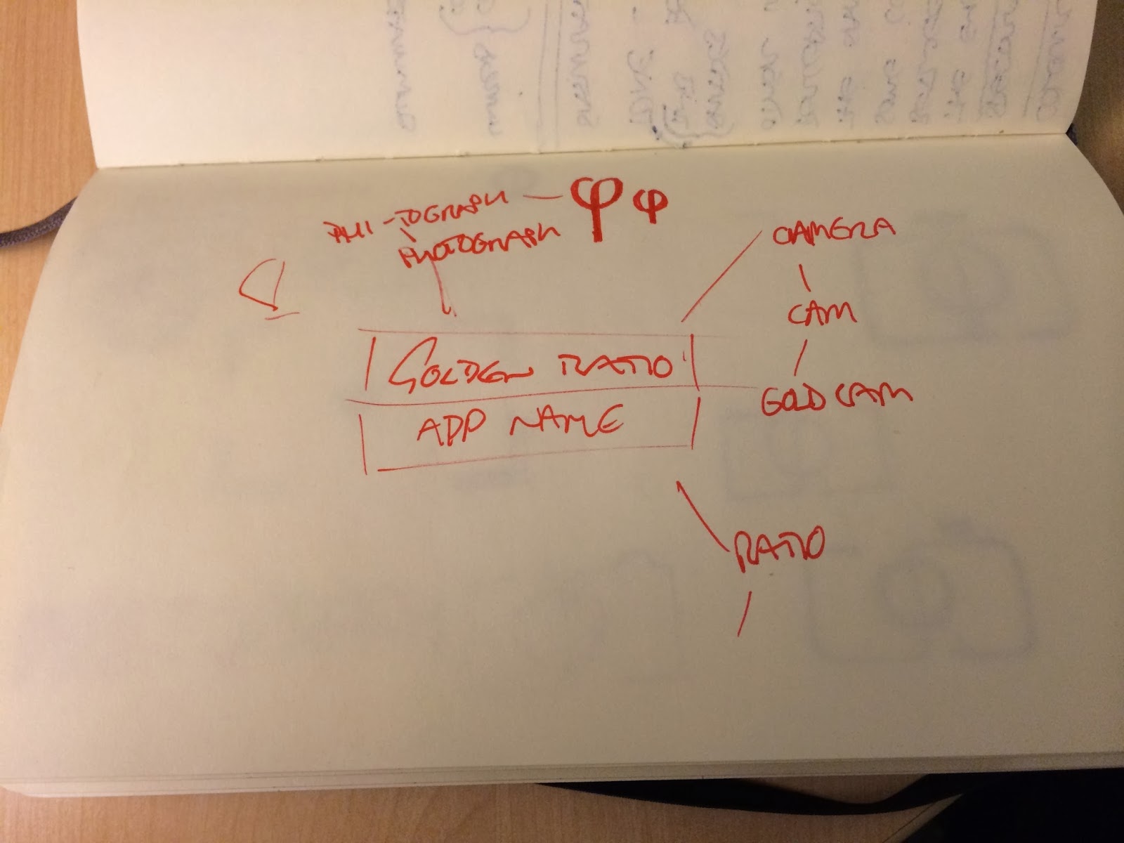
I started brainstorming an idea for the app. As you can say it didn't take me long until I came up with a name that I was happy with. I decided to call the app 'Phi-tograph.' A play on words with Phi (the greek name for the golden ratio) and photograph. 
I showed the plan shown above at the crits and explained the basic idea. I got nothing but positive feedback. People really liked the idea and said it was something that they would use. 


OUGD405 - Studio Brief 3 - Page Layout (Indesign) [1/2]

I started this project by looking at the research that I had collected in the previous brief and picking out the main points that I intended to communicate with my double page spreads. 
I then started looking at editorial design online to try and get some inspiration and ideas. My research is shown on my design context blog here.  


I then started setting up my document. We were given precise instructions about the size of our pieces so I had to ensure that these were all met when setting up the document. As you can see I used columns to ensure that all the different elements within the document would line up. I also put a 3mm bleed around each side to ensure that anything I wanted printed to the edge would print right to the edge.


I then set up a baseline grid so that my type would all sit on the same baseline. It often looks messy when you don't use a baseline grid and it is a good way to ensure that your pages stay neat. I made the  increment every value 13pt as i was using 10pt type and I feel that this is a nice amount of leading for this size type. I decided to use Din as my typeface for this brief as It is bold and legible, it is also slightly rectangular and geometric which suits the subject matter of the golden ratio. 


I designed a couple of icons to go at the bottom of the pages in Illustrator. I used a rectangle that was split at the golden ratio and worked around this.


I then opened the master page on InDesign and put these in the bottom margin, ensuring they were lined up with one another and with the columns. 


I wanted the icon in the bottom right hand corner to be a page number and as putting the number in manually on every page would be time consuming and problematic if i was moving the page order about I decided to use a tool on InDesign called 'Insert Special Character.' This allowed me to put a marker in which would be replaced for the page number.


I started designing some of the elements that I would need for my layouts on Illustrator including titles and diagrams. I could then copy these into my InDesign document. I would have to go back and make more as I still wasn't completely sure of the content I was going to use. 


I placed some of the graphics and titles in where I thought they would look effective. I then experimented with the placement of the type. I used lorem ipsum at first just to see how bodies of text would look. I like the way that the title in the logarithmic spiral leads into the intoductory body of text. 
I used lines to divide up the page as I have seen being done in some of my research. I made the lines on illustrator, the ratio of the dashed section of the lines to the solid sections is  1:1.618, the golden ratio.


I decided I didn't want to overcrowd my pages with photographs so I decided to use some illustrations as well as a few photographs. I drew an arm a shell and a dna strand, all things that utilise the golden ratio. I then scanned these drawings in and edited them on photoshop. I used the threshold tool to make the images black and white and then the color range tool to delete all of the white from the images.


I used these drawings along with some vector imagery that I designed on illustrator to display the presence of the golden ratio in nature. On the top of the page I put block colour made from the negative space of a logarithmic spiral. I made the colour 50% transparency so it is the same as the other yellows but you can still see the graphics in that yellow that are at 100% where they overlay.
I used a title that I designed in Illlustrator to fit flush into a golden rectangle. Although this isn't obvious I feel it is good to use the golden ratio within the design of the piece, even in places where it is incredibly subtle. 


I wanted to display some quotes about the golden ratio on my double page spread but in an interesting and unusual way. I did experiment with having them laid out in a standard grid format and although this was legible and easy to read there was nothing different about it. I have seen the use of blocks of colour underneath sections of type when I was doing my research and I came up with the idea of using blocks of colour in a logarithmic spiral and then putting the text over the blocks of colour. I used a golden rectangles as the blocks of colour. I have lost the illustrator file unfortunately but I made the blocks of colour on illustrator and then copied it across. At first I had all of the rectangles the same size but it just looked a little bit messy and overcrowded, especially towards the middle of the spiral. I got some feedback from classmates who said it didn't particularly look like a spiral either. I made the rectangles get gradually bigger from the centre outwards. This looked much better. 

Friday, 17 January 2014

Type Journal


The brush style typography at the bottom of this poster really stood out to me. I tried to find out the typeface that the designer has used but was unsuccessful. It is apparent that the font has been inspired by brush typography and graffiti writing. This makes the type look more urban and informal.


I really like the type used for the title of this advertisement. I like the way that the stroke width has massive variations and also the way that the terminals and the serifs are quite decorative. Despite these decorative elements to it the typeface has a modern feel to it. You do not often see serif fonts that aren't slab serifs that have a modern feel but the designer has achieved this with this typography. 


This typeface is called Reklame Script. It is designed to look handwritten and I think it looks similar to old style sign painting as well as taking some inspiration from the lettering used within graffiti and street art. The type has a youthful feel to it and I think it would be suitable for design aged at young males.


This bold slab serif font is really effective. It catches the eye, has a modern feel to it whilst keeping some sort of traditional feel. The weight of the font and the tight kerning thats been used makes it look friendly and not at all corporate.


I have displayed this advert as I not only like all the typefaces used individually but I think the type hierarchy and the way the fonts have been used together is really effective. The firs thing we read is 'Mum's Brownies' despite the word 'brownies' not being at the top of the page. This is due to the block type that has been used, it looks to me like Din. It is bold as it is and with the 3D effect that has been used this boldness is increased. The other sans serif typeface that has been used is Gotham. This is a very neutral font that is possible as simple as possible, the way this has been contrasted with a fairly decorative serif font works really well.  


I was unable to find out which typeface was used on this poster. It is a condensed typeface which makes it easier to fit a lot of information into a small space. I think the way that the line weight doesn't change makes the typeface look more modern. The relatively thin line weight makes the type look high end. 


The massive variation in line weight on the bold typeface shown above is the reason I photographed this piece. It is incredibly bold and has a lot of impact. At the same time the serifs and the variation in line weight give the type a slightly traditional look. 


The block typeface used on this design is bold and catches the eye straight away. This suits the style of the advert with the bold block colours. The typeface looks fairly organic and doesn't look really clean and clinical. This makes it seem friendlier and less corporate. The logo uses a light serif type with wide spacing between the characters. This looks classy and makes the brand look well established.

OUGD405 - Studio Brief 2 - Research


For studio brief 2 we all chose a word from a hat. We the had to research around this word, specify content related to the original research and then collect an array of research around this topic. We were told to collect 20 facts, opinions, words, statistics and photographs.


I started my research by doing some mind maps around the word I was given. I came up with a few ideas, however I was only really interested in one and this was the idea of looking at the architecture used within the show 'Game of Thrones.' The different cities and castles are a big part of the show and the difference in styles of architecture is vast. 


I started mind mapping what I could research into based around 'Game of Thrones' Architecture. Like I have said there is a huge amount of architecture in the show and I assume George RR Martin and the makers of the show did their research into styles of ancient architecture before designing the sets, however I found it difficult to get much information on the subject. 


When I got feedback on my ideas I didn't get any really positive feedback. I feel my ideas were a bit straightforward and my thinking had been too linear. I spent time online looking for other subjects based around architecture and also did some more mind mapping.


From this mind map I got the idea of looking at architecture within nature. I thought about looking at animals that build their homes such as termites, birds and otters. 


When looking at architecture within nature I stumbled across the subject of the Golden Ratio. It is a pattern that repeats itself within nature and has been described as 'the architecture of nature.' The Golden ratio is used within human architecture aswell. In fact the greek name for the ratio (Phi) derives from the name of a famous Greek architect, Phidas. I spent time gathering information on the golden ratio and put together a presentation to show to the class. The link to this presentation is shown here.