BRIEF
Promote Goat Collectives exhibition Disposable Society to a wide target audience. Produce striking poster and flyer designs and digital advertising elements such as gifs and Facebook headers. Try and be as creative and unique with the advertising as possible. Transfer this aesthetic to the curation of the show itself, incorporating the chosen aesthetic into signage, programmes and other necessary designed elements.
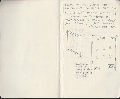
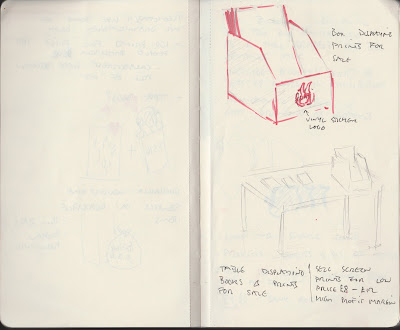
We place quite a lot of importance on the promotions and planning for the Disposable Society Exhibition as it is our first curated exhibition and naturally we want it to be a success with lots of people coming down to the launch night. Displayed below are various pages of notes concerning the promotions and planning.
We met with the Operations manager from Northern Monk to discuss the hanging of the work and the use of the space, the dates and the times available.
We considered framing the work and some members of the collective had various ideas on how we should frame the work. Some members felt that individual artists should frame their own work but we decided that this would look a bit mismatched with different style and colour frames. Some members felt we shouldn't frame the work at all for ease of hanging and to ensure we kept the weight down. After discussions concerning practicality and aesthetic we decided we would build our own open frames out of 2x2 or 2x3 and leave the wood unfinished. We felt this would work with the disposable society theme and would look good having consistent framing throughout. We decided that only work on the wall would be framed and the work hanging in the centre of the room would be hung from fishing wire (sketch above) with bits of rubbish such as bottles and cans weighting them to the floor. Not only does this fit with the theme but as the exhibition is being held in a brewery makes sense in this way also.
Drawing from some of Mr Brainwash's ambitious but successful ad strategies in the documentary 'Exit through the Gift Shop' we decided to offer a screen print to the first 100 people through the door. We felt this would ensure that the exhibition starts off with a bang.
We decided that as we were expecting large number of people at the exhibition we may as well try and make some money from it in ways other than taking a curators percentage. We plan to sell some screenprints of work from various people in the collective at an affordable price £8-£20 as many of the attendees will be students and this will be much more within their price range.
Playing on the stereotypical clean, minimal white aesthetic of contemporary art galleries would be a good way to approach the advertising of this exhibition as it almost juxtaposes with the idea of disposable items. We collected items found in skips, rubbish from our kitchen and various other disposed of objects and I spray painted them white. The super clean aesthetic seemed to give the objects value. When photographed nicely I felt they would produce a really striking image. We experimented with a few compositions, we all had a go at arranging the objects but we decided on the composition shown below. I put this together with the intention that it looked fairly natural. Almost as if it could be in someones kitchen the day after a party.
Karl, Goat Collective's photographer sent across two versions of the image. One which used the really white aesthetic that we originally intended to use and one which did the opposite and bought out all the imperfections. Although the dirty image is strong and we may use it somewhere within the promotion, as a collective we decided to keep the ultra clean white aesthetic.
This is just the first step in producing all the promotional material, there is lots that needs to be done and time constraints may limit what we are able to do.


0 comments:
Post a Comment