My blogs been a bit quiet lately but everyone at Goat has been so busy. More details to follow but for now this gif should give you some kind of idea of what my head currently feels like.
Wednesday, 24 February 2016
Friday, 12 February 2016
Disposable Society Guerrilla Advertising
In the past I have worked quite a lot with stencils and spray paint and I came up with the idea of utilising these tools to advertise the event in a unique, cost effective way. Using the same font (Avenir Heavy Oblique) as the call for subs posters ensured continuity with these posters. The type is bold and simple so easy to cut into a stencil and very legible for people passing on foot or in cars. Obviously the stencil couldn't be painted onto walls as this is illegal and we wouldn't want illegal activities associated with Goat Collective. Instead we decided to take advantage of the rubbish on the streets in Leeds and Hyde Park Especially. This is a clear link to the idea of 'disposable society.'
I will continue to paint this stencil on bin bags and other rubbish up until the event. We have already had recognition on Instagram from this advertising approach and hope for this to continue.
Disposable Society Promotions and Planning
BRIEF
Promote Goat Collectives exhibition Disposable Society to a wide target audience. Produce striking poster and flyer designs and digital advertising elements such as gifs and Facebook headers. Try and be as creative and unique with the advertising as possible. Transfer this aesthetic to the curation of the show itself, incorporating the chosen aesthetic into signage, programmes and other necessary designed elements.
We place quite a lot of importance on the promotions and planning for the Disposable Society Exhibition as it is our first curated exhibition and naturally we want it to be a success with lots of people coming down to the launch night. Displayed below are various pages of notes concerning the promotions and planning.
We met with the Operations manager from Northern Monk to discuss the hanging of the work and the use of the space, the dates and the times available.
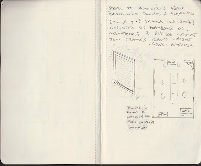
We considered framing the work and some members of the collective had various ideas on how we should frame the work. Some members felt that individual artists should frame their own work but we decided that this would look a bit mismatched with different style and colour frames. Some members felt we shouldn't frame the work at all for ease of hanging and to ensure we kept the weight down. After discussions concerning practicality and aesthetic we decided we would build our own open frames out of 2x2 or 2x3 and leave the wood unfinished. We felt this would work with the disposable society theme and would look good having consistent framing throughout. We decided that only work on the wall would be framed and the work hanging in the centre of the room would be hung from fishing wire (sketch above) with bits of rubbish such as bottles and cans weighting them to the floor. Not only does this fit with the theme but as the exhibition is being held in a brewery makes sense in this way also.
Drawing from some of Mr Brainwash's ambitious but successful ad strategies in the documentary 'Exit through the Gift Shop' we decided to offer a screen print to the first 100 people through the door. We felt this would ensure that the exhibition starts off with a bang.
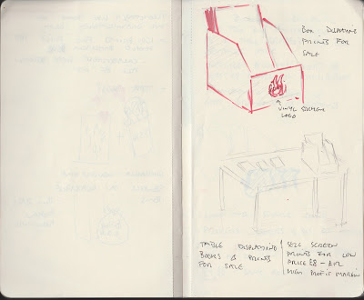
We decided that as we were expecting large number of people at the exhibition we may as well try and make some money from it in ways other than taking a curators percentage. We plan to sell some screenprints of work from various people in the collective at an affordable price £8-£20 as many of the attendees will be students and this will be much more within their price range.
Playing on the stereotypical clean, minimal white aesthetic of contemporary art galleries would be a good way to approach the advertising of this exhibition as it almost juxtaposes with the idea of disposable items. We collected items found in skips, rubbish from our kitchen and various other disposed of objects and I spray painted them white. The super clean aesthetic seemed to give the objects value. When photographed nicely I felt they would produce a really striking image. We experimented with a few compositions, we all had a go at arranging the objects but we decided on the composition shown below. I put this together with the intention that it looked fairly natural. Almost as if it could be in someones kitchen the day after a party.
Karl, Goat Collective's photographer sent across two versions of the image. One which used the really white aesthetic that we originally intended to use and one which did the opposite and bought out all the imperfections. Although the dirty image is strong and we may use it somewhere within the promotion, as a collective we decided to keep the ultra clean white aesthetic.
This is just the first step in producing all the promotional material, there is lots that needs to be done and time constraints may limit what we are able to do.
Tuesday, 9 February 2016
Secret 7 Initial Ideas
I decided to design a sleeve for Tame Impala's 'The Less I Know the Better' because I love the track and the band itself. There was no real debate as to which track to choose .
I began to generate some ideas surrounding the song title. I chose to work with this as my starting point rather than taking a more abstract approach as I felt that the idea of 'The Less I Know the Better' fits perfectly with the entire idea of Secret7 and the customers being unaware of the track they are purchasing. I came up with the ideas of using codes as this is a form of concealment of information. I looked at various codes; ancient greek codes, the caesars cipher (or shift), pig latin amongst others. However the odes which really caught my attention were the codes that Thieves in Southwest China use (shown below) and the 'hobo code' used throughout America at the beginning of the 20th century and throughout the Great Depression. (Read more here)
I considered either using some of these symbols within my record sleeve design or possibly producing my own set of symbols. However I felt that making my own alphabet code would make more sense as then with the help of a key anyone could decipher it. I have been working with letterpress in probably it's most simple form recently just typesetting basic passages of text. I want to begin working more experimentally with this process and felt that this brief could be the perfect time to do this. I will have access to a number of non-letter glyphs to work into a code. I also feel that as Letterpress was the first way that humanity began to disseminate information the process itself essentially contradicts the title. Although this could be looked at as a negative I think that using a process so historic in the sharing of information to print a coded message is ironic in a sense and I think it will work well.
I considered using the song title typeset in latin as this was the beginnings of language in the same way letterpress was the beginnings of print. I decided against this to instead focus on the idea of using codes. I do like the use of letters within the design so I may incorporate an alphabet code such as the caesars cipher within my design.
I began to look at some practitioners who work with letterpress but struggled to find the kind of work I was after. I wanted to look at contemporary decorative letterpress work rather than work where the process was used in the way it was initially intended. Work by Nick at The Print Project was something that really inspired me. The below image really inspired my initial experiments with using letterpress in this way.
I contacted Nick to see if I could go and visit his studio at some point and to tell him about the 'Disposable Society' exhibition that Goat Collective is curating.
I also checked out a book called 'Reinventing Letterpress' and found some other practitioners who work with letterpress in a contemporary way.
I worked with metal type from various font families and made a code using these various glyphs, for example an 'L' is an exclamation mark.
The above pattern reads 'The Less I Know the Better' when applied to a simple key. I will be experimenting with different colours and may look at using gradients and overlays. I only used this red colour as I already had the ink rolled out for another print I was doing. I am pleased with the outcome of this experiment and intend to continue using this process.
Wednesday, 3 February 2016
Progressio Poster
A friend asked me & Ellie to design a poster for the fundraiser night that she was putting on. She asked for it to be colourful and funky. We only had one night to produce the poster but we felt we were up to the task. Our friend provided the text that was to be on the poster. Due to the volume of copy and to ensure the poster was legible at all sizes we decided to design a primarily type based poster. We wanted to incorporate a colourful border and for this we decided to enlist the help of another of Marley's friend and fellow member of Goat Collective, Aidan Whitley. He sent across a selection of patterns of which we chose the one displayed below.
We discussed the style of lettering that we wanted to use for the poster. We decided to use a handdrawn aesthetic with non uniform letter sizes and angles to convey the fun informal nature of the event.
We couldn't use hand drawn lettering for the entire poster due to the volume of information necessary so set some content in a heavy sans serif typeface. We continued with the use of all caps and the bold clean style contrasted nicely against the handrawn lettering. We put this copy in boxes to make it contrast further and increase legibility.
The colours were picked from the pattern that will be used for the border. We chose bold or bright colours for the information and a nice pastel colour for the background This unites the copy with the border image nicely and as the colour palette for the pattern was already strong there was no need to consider the colour any further than this.
Using the liquify tool we warped the edges of the border to achieve a slightly psychedelic aesthetic. This worked in unison with the lettering much better than the solid border.
Considering the short timeframe we had to complete this design we were both happy with the outcome and received good feedback from the team running the event as well as peers.


