For studio brief 3 each of us was given a Bruce Willis film. The film that I got was die hard which originally I was pleased about as I have seen it before on a few occasions and I immediately thought of some ideas. There is lots of iconic imagery in the film and I was sure coming up with a strong idea wouldn't be too difficult.
I sat down and watched the film and wrote down some of the ideas that I had whilst watching it whilst also jotting down lines from the film and some things that I thought would be iconic and I would be able to do something with. I was planning on doing something with broken glass originally as this is a recurring theme throughout the film. I decided to look at some alternative movie posters on the AMP website to see what was already out there. I also searched online for alternative Die Hard posters. I found a huge number of alternative posters for the film but this wasn't surprising considering its popularity. I have displayed some of my favourite posters here, on my design context blog.
A lot of the ideas I got when watching the film have already been done which was irritating as I wanted the design to be original.
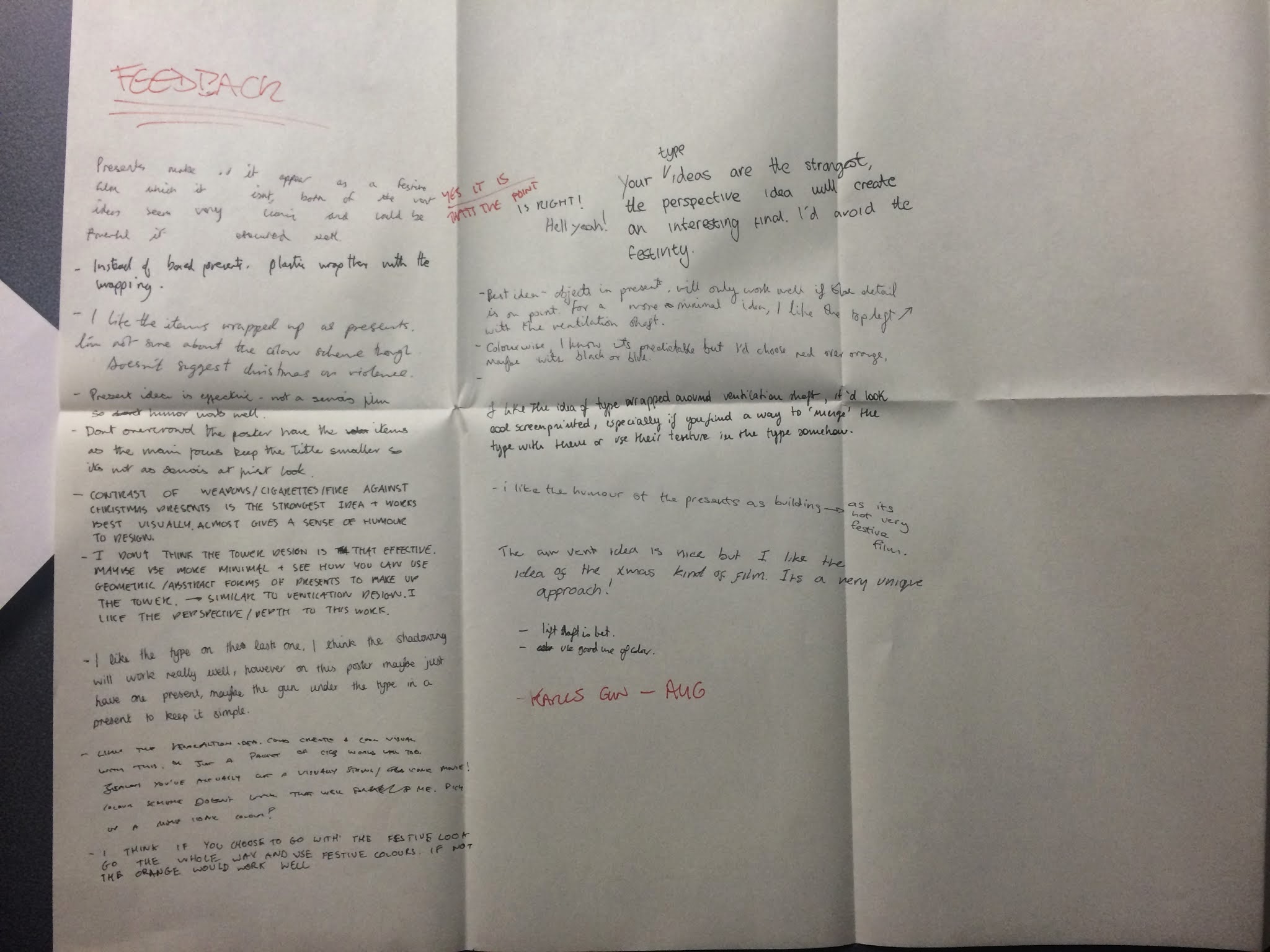
Shown above are 4 of the ideas that I had. My favourite ideas were the ones that involved Christmas as I haven't seen any posters that incorporate this theme despite Die Hard being a Christmas movie. People don't normally think about it in this sense because it is a very unconventional Christmas film. I showed these designs at the interim crit and got a lot of feedback which backed up my own opinions on the designs. One piece of feedback that I got from a few separate people was that If i was going to go with the Christmas theme then I should use a colour more appropriate to this. I decided to use black and red instead of orange. This is not only a festive colour but also represents danger which is perfect for the film.
The design that the majority of people liked the most was the one with the illustrations of the items he finds throughout the film wrapped in presents. Not only did people say they thought this would be the most aesthetically pleasing but they also felt it was the strongest conceptually and I agree. I had already done a couple of the illustrations to use in this design which are shown on the same page. I drew a walkie talkie and a roll of tape as well as these are two more items the main character finds throughout the film.
After drawing out all of the items I put them into Photoshop, edited the levels and curves and then Image traced them in Illustrator. I liked the line quality that this gave the images. Shown below are the illustrations after I image traced them.
I was happy with the illustrations, the gun in particular. I ensured that I drew the actual gun in the film (an MP5) as I thought this would give it authenticity. A better quality image of this illustration is shown below.
I experimented with illustrating presents to lay over the illustrations like I did in the plan but I didn't like the combination of really clean vectors with the hand drawn illustrations. I also felt that they obscured the illustrations too much. I decided instead to draw tags on the drawing to keep the Christmas theme and the whole idea of the objects that John McClane finding being presents. As I had already drawn out the illustrations I didn't want to have to go back and redraw them with tags on. Instead I drew the tags on tracing paper directly over the original illustrations to get the proportions right.
I then went through the same process as with my previous drawing, editing them in Photoshop and then image tracing them. I wasn't sure how difficult it would be to line them up properly but it was much easier than i expected.
I decided that instead of just laying the illustrations out how I had in the plan it would look good if I used them as a repeated pattern. I also felt that this might look like wrapping paper which again backs up my Christmas theme.
I used Gotham bold italic as the typeface and halftoned it as it distracted away from the illustrations when I used block colour but I still wanted a bold typeface. I felt that the design was strong but I came up with an idea of how to develop it even further.
I still want to incorporate broken glass into the design and I was considering fragmenting the design as if it was printed onto glass that was then broken. I decided that it would be much more interesting and effective to actually do this in real life as a lot of the posters already use broken glass and taking this literal approach to it would be really unique. The photograph below shows what gave me this idea, it was a shop front with shattered glass.
I remade the repeated pattern without any type. I intend to screen print the type onto glass and then break this and lay it over the design shown above. I think that giving the design layers like this will add texture and depth to the piece and make it unique. I am unsure of how I will go about doing this but I will speak to technicians in college and find out what the best way is.


0 comments:
Post a Comment